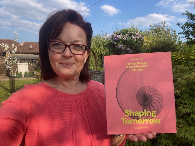
It’s been two weeks since Clerkenwell Design Week and what a corker of an event! So many interesting panel discussions, networking events, wellness sessions and brilliant people to meet. With my passion for colour and the influence it has on brands, businesses, our lives, homes and our wellbeing, it was a delight to be surrounded by people who share my desire to understand and talk more on this topic. But before we dive in, from the sessions I joined and participated in, here’s some key stats that landed for me, I hope they resonate and spark curiosity with you too.
Did you know…
- 77% of CEO’s use creativity to drive productivity
- Colour increases brand recognition by 80%
- Colour is an integral part of brand recognition
- 62% to 90% of decision making is based on colour alone
- Trends in colour are influenced my multiple factors from science, intuition, inspiration, social trends and customer preferences, to societal, technological, economic, cultural and political narratives
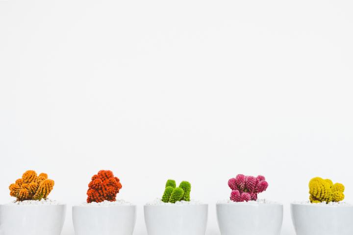
- In 2020 there was an acceleration in the trends towards green, nature and biophilia
- Indoor plant sales have doubled in the last 4 years
- Milan Week 2025 revealed that the colour trend is moving towards copper (particularly in directional pieces) and butter yellow
- Colour for workspace aesthetics trends (2026-2030) include dynamic brights, luminous blue, acidic tones, lava red, metallised colours, all-clusivity, heritage hues, refuge wellness rooms, meadowland green, and nourishing greens, transformative teal, sensorial darks, and a priority towards mental wellness
The journey of colour
In the design world, there are many stages for the journey of colour and its timeline to reaching customers in the market. From ideation where multiple factors influence and are considered in identifying a colour trend, to the innovators and early adopters who buy into the colour before it’s reached peak popularity, to the late adopters who typically buy into the colour 1.5 years post peak popularity, then the laggards who consider purchasing this colour three years post peak popularity. It’s not until it reaches this last stage, when the colour or colours have really connected to public consciousness, that a decision is made by the company about whether the colour will be maintained, go into retirement, or potentially become an all-time classic.
It’s a colours journey through all these stages, spanning 5+ years from innovator to laggard, that enables a business to discover real world outcomes, through research, workshops, seminars, commercial development, marketing and delivery – insights from all these areas along the colour’s timeline inform its life and potential end of life treatment.
Moreover, whilst a colour or trend will suit (or not suit), a brand, product, customer demographic or region, and all sectors including fashion, automotive, interiors and more have their own look books, it was fascinating to hear that so many aspects inspire the innovators and ideation of a colour, sparking imagination of the next colour trend years before it hits the market.
What is the future of colour
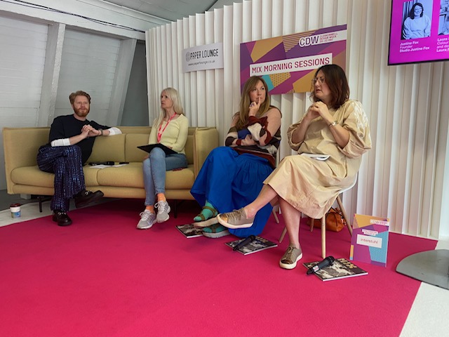
This is a pretty loaded question when you think about it. With the advancements of colour and AI, the demand for sustainability in colour, and the desire for design and colour beyond aesthetics – three key topics for discussion – the panel session hosted by Mix Interiors really got me thinking.

Colour & AI
AI is an interesting tool for the design industry and it was a hot topic to kick off the discussion between Harry McKinley from Mix Interiors and his panel of guest speakers Karen Haller Laura Perryman and Justine Fox. At this current time, it was felt that AI can create colour palettes, but a human will always need to give a human touch to complete the palette; but will it remain this way – the jury was out. At present, the panel felt we are only just starting to use AI with colour; however, it can make colour theory more digestible. They also went on to suggest that AI doesn’t feel, it’s not intuitive but it’s great for automation. AI can’t create a new aesthetic in or for design; it doesn’t have lived experiences or sensory perception. It doesn’t intuit or lead.
Karen Haller commented, “AI can’t imagine, it can only react”, “Colour influences how we think, feel and behave” and “Constantly changing colour trends pushes people towards short term choices.” We need to align colour with nature, nature doesn’t follow trends. She went on to say, when we “Apply colour with psychological insight to support how people think, feel and behave” we get the results we seek.
Colour & sustainability
The second topic hotly debated by the panel of experts focused on colour and sustainability. We were reminded that the colours we choose in the built environment have a huge impact on heat retention and using energy, therefore the functional aspect of colour is really important. We need natural, non-toxic colour pigments, nature positive dyes. There’s also lots of ways we can integrate waste products, weeds and other materials into dye, building colour palettes from and for local communities.
Laura talked readily about the “Right to repair”, which reminds me of the ‘make do and mend’ mentality. But it’s more than that, there’s a growing need for sustainability, for products to have a longer life span, to be able to fix and repair things, rather than have a throw away and replace mentality. We need to be able to increase longevity of products, to improve long-term investment. Colour can be adaptive and emotive, helping us connect with the climate and our environment.
Colour beyond aesthetics
The more we can understand colour, the more we can use it too support us, our wellbeing, and our lives. In addition, as we move towards colour beyond aesthetics, the panel reminded the audience that colours are circular – they come round in cycles, materials are circular – they come round in cycles, and that trends are circular – they come round in cycles.
It seems to me that everything comes in cycles, every day, week, month and year. Like nature and the seasons, our world operates and lives in natural cycles.
As mentioned earlier, the influences on colour trends are many, spanning social, societal, political, technological, cultural, economic and ancestral. Yet with all these insights and drivers, we need to be able to create nuance and personalisation – to find peoples own needs in colour, be that warmth, comfort, excitement or feeling grounded.
There is a growing trend towards personalisation – however, there’s also a need to stop looking externally for what’s right for us. Perhaps this is an invitation to go within and ask the question ‘What’s right for me?’.
It was referenced more than once that at present, due to political and economic influences, as humans we have double fatigue, so it’s more important than ever to look into how colour can support our wellbeing.
To close the panel, Harry McKinley, managing editor, MIX Interiors, asked the panel in three to five words to say ‘What’s next in colour, what’s the trend?’
- For behavioural and emotional benefit – Karen Haller
- Design and quality – Laura Perryman
- Beyond aesthetics – Justine Fox
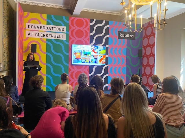
Conversations at Clerkenwell
It was fascinating being at the session hosted by Alexi Cowan, head of interiors, WSGN, where they focused on colour for workspace aesthetics trends 2026-2030. They also highlighted three key trending topics, ‘Joy in colour’, ‘Power of Nostalgia’ and ‘Holistic wellbeing’.
Joy in colour
This is all about purposeful play, the importance for all ages to integrate play into their day, celebrating micro moments of play to spark joy and creativity, and to make sure that play aligns with your company values. In interiors this means making designs fun and functional, adding layers for depth, thinking about textures to enliven our senses, the agile use of furniture and design, for interiors and design to be a channel for self-expression, and to focus on personalisation. It’s a must to link colour to your collections and to also bring colour to functional pieces.
Power of nostalgia
Here the focus was on nostalgia; for example, to consider using faux products and finishes, to create cocoon like spaces, to use wood as a finish and colours that have an amber haze or cocoa powder feel. The was an invitation to think of brown as the new black, to consider metallic finishes and copper tones, to create luxe high-end finishes, and to embrace shape, silhouettes, colour and style, to combine modern with old, as a means to bring a nostalgic element to design – think cherry lacquer, dark berry tones with high gloss finishes to create a seductive, luxurious experience.
Holistic wellbeing
For me, the continued focus on wellbeing is a must – harmonious palettes, neutrals, tonality and external contrast, with a lean towards pink pigmented hues, less orange terracotta, colours that are warm, earthy, and resilient. Biophilic design will continue to be popular with interior living plants, spaces that have lots of amazing natural light and are relaxing airy spaces that have a high-end, quality finish.
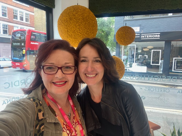
On the wellbeing front, it was wonderful to participate in a ‘self-massage workshop’ hosted by Nordic Design House, plus to have lunch and catch up with Mags.
Until CDW 2026 – Thank you!
I appreciate this has been a bit of a whistle stop tour, but I hope I’ve sparked your curiosity about what’s possible with colour and what’s coming in the world of colour.
A huge thank you to everyone who made my #CDW2025 experience so colourful and expansive – Karen Haller, Justine Fox, Laura Perryman, Harry McKinley, Magdalena Tym, Michaela Reysenn, Catriona Hammett, Mary Sholl, Charlotte Raffo, Emma Freeman, Alexei Cowan, Jason Graham, Seetal Ladva, Domus Group, MIX Interiors, KAI Interiors, Nordic Design House, Hansgrohe, Colourhive, WGSN, Soundbox Store and many more.
Let’s work together
With over 20 years of experience working with innovative and disruptive-tech businesses across a variety of sectors – from HR-tech and digital to creative agencies and interior design, I bring a blend of commercial acumen and creative thinking to everything I do. I’m a strategic yet hands-on leader with a passion for collaboration and an action-oriented mindset that delivers real results.
My approach is human to human, balancing the analytical left brain (facts, figures, and data) with the intuitive creativity of the right brain (emotion, imagination, and storytelling) – because I believe the magic happens when you combine these two key ingredients.
Get in touch – I’d love to talk.
Header image: Snapped at Clerkenwell Design Week