Earlier this year, I entered the uFurnish.com awards in the category Best Before & After Transformation, sharing the renovation journey of my home, Albany Cottage. And recently, I found out I’d been shortlisted.
Honestly, it felt really special. Not simply because of the recognition, but because this project has represented so much more than interiors or decoration. It has been a story of creativity, resilience, reinvention and rebuilding, both of a home and, in many ways, myself too.
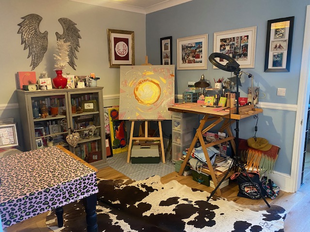
Marketing by Day, Artist at Heart
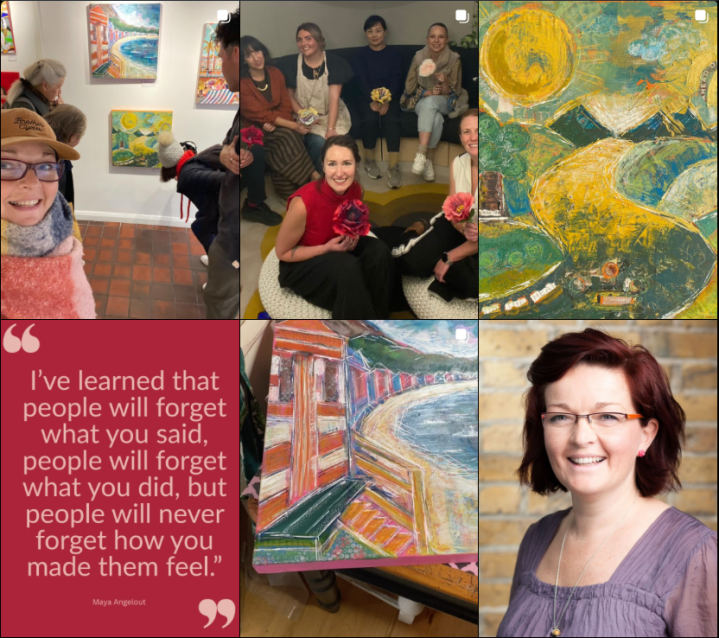
Many people know me through my work in brand, marketing and communications. But creativity has always been the thread running through everything I do. Alongside my marketing work, I’m also an artist and coach, hosting workshops to explore colour and creativity, and how being creative plays such an important part in our lives.
My home, Albany Cottage, become the physical expression, the canvas, of my love of colour and being creative.
Seeing Potential Where Others Didn’t
When I first viewed the property, it had been empty for 18 months. It was tired and in need of love. Rusty radiators, layers of dated wallpaper, net and velvet curtains, an avocado bathroom suite, and rooms that felt heavy with old energy.
Many people would probably have walked in and straight back out again due to the volume of work needed. But I believe homes hold energy and I could feel its potential, I knew this house could become something beautiful. Not perfect, as I know it wouldn’t be polished overnight, but this was an opportunity.
Rebuilding a Home and Myself
What followed was a full renovation journey that pushed me far beyond my comfort zone.
There were budgets to manage, builders to negotiate with, endless decisions to make and many restless nights spent sleeping under dust sheets whilst rooms were transformed around me. I became very familiar with paint stripper tools and the phrase “every day is a school day” as there was so much to learn.
There were tears alongside triumphs, but slowly, room by room, the house began to feel different, lighter, as it came back to life. I felt like I did too.
The Emotional Power of Colour
Colour became one of the most important parts of the transformation, not simply aesthetically, but emotionally and psychologically too.
As someone who has studied applied colour psychology, I’m fascinated by how colour influences how we think, feel and behave. Whether in our homes, for brands and in everyday environments, colour shapes our experience.
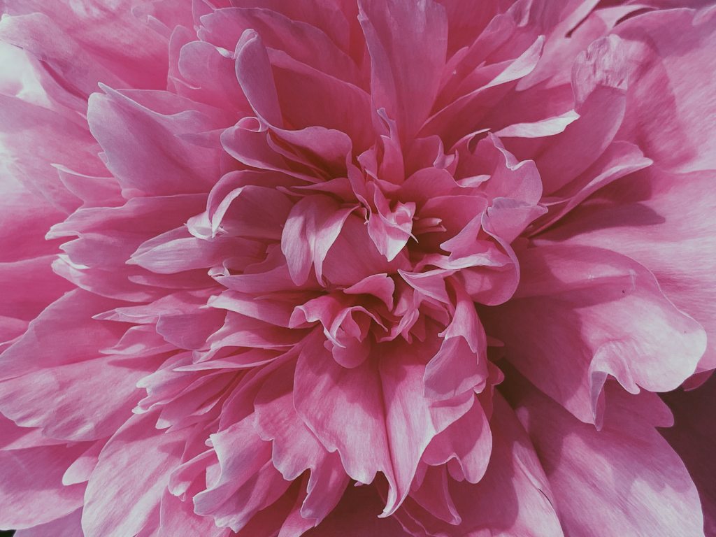
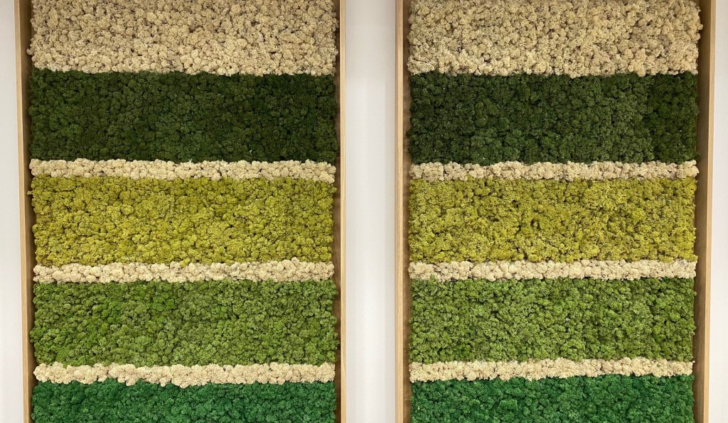
Pink brought warmth and softness, green became grounding and refreshing, and earthy tones created a sense of calm and grounding. Every choice was intentional. Even now, the orange and pink trim I have on my stair runner makes me smile every single day.
Creativity Has the Power to Transform
This shortlist has reminded me that creativity is never just about making something “look nice.” Creativity helps us process change, it reconnects us to ourselves, it turns emotion into expression, and it transforms spaces into places where memories can be made.
Whether I’m leading a brand discovery session, hosting a Colour & Creativity workshop, or painting a bespoke commission piece, my work always comes back to the same thing… helping people connect more deeply to themselves and the world around them.
Colour and creating New Beginnings
So, here’s to taking brave steps into the unknown, here’s to homes with heart, and here’s to colour, creativity and trusting your intuition, and your vision, even when things feel messy, uncertain or unfinished.
I know, now two and a half years on from picking up the keys, my life and my home look and feel very different. Transformation needs imagination, a clear vision and resilience to follow through and take action. Nothing happens without making choices, often tough ones. As a great teacher once said, “You’ve got to learn to hang with the tension.”
Here’s to building spaces, lives and stories that light you up.
And if you feel like it, you can vote for me and Albany Cottage here – You’ll also be able to see all the before, during and after shots to get the full picture.
With joy and colour,
Emma 🧡