As we step into a new season and quarter, April feels like the perfect time to embrace a fresh, creative mindset. Over the past few weeks and months, conversations with a couple of inspiring women have sparked the idea to develop two unique creative workshops. I’ve been intentionally seeking out collaborations with coaches, artists, practitioners, and specialists to co-create something new – blending my love for colour, creativity, and intuitive, conscious decision-making with our shared skills. The goal? To craft magical, memorable experiences that truly resonate on a human level.
Here’s a brief overview of the workshops to whet your appetite…
Conscious Creativity
- Are you feeling stuck or creatively blocked?
- Do you want to feel more connected to your body and your emotions?
- Have you felt a craving for a playful, supportive, soulful experience?
Remembering the art of play and curiosity through creative embodiment, Conscious Creativity is a soul-nourishing workshop that invites you to explore creativity as a healing practice. Through colour, intuitive art, guided meditation, and somatic movement, you’ll reconnect to the wisdom within and find joy in self-expression – without judgment or pressure.
This isn’t your standard workshop and you can expect something a little different as you will experience a blend of grounding breathwork with gentle transformative somatic movement and intention setting, to creative expression through writing, colour and intuitive painting. A space to share, express, be seen and heard.
Hosted in Blossoms Wellness Centre, tucked away in the countryside village of Kilmington, Devon, the event will be hosted by me and Gemma Norris.
Gemma is a healing practitioner and is the founder member of The Infinity Health Hub. She has 16 years’ experience in Reiki, Myofascial Release, body work therapies and brings a grounded yet intuitive presence to her practice. Discover more about Gemma Norris here.
When does the workshop take place?
- Sunday 4th May, 10:00 to 13:30, Blossoms Wellness Centre, Devon
- Book now – Limited to 20 spaces
Colour & Creativity
- Have you always wanted to do something creative but didn’t know where to begin?
- Are you curious about playing with colour but afraid of “getting it wrong”?
- Maybe you’ve looked into traditional art classes or workshops, but none of them truly struck a chord?
If you’ve nodded along to any of these, then our Colour & Creativity Workshop is made for you.
At the heart of Colour & Creativity is a shared passion for helping people reconnect with themselves. For me and Cesca, creativity is more than making something beautiful – it’s a form of mindfulness, a moment of meditation, and a way to ground yourself in the present moment. We believe colour and creativity can transform lives in small but meaningful ways.
Join us for an afternoon of colour and craft where you’ll be guided through the process of creating a beautiful crepe paper flower and gain an understanding of how to use colour.
Based in Surrey, South London, Cesca is a multidisciplinary artist with a background working as a display artist for Anthropologie, as well as working in TV and Film, her portfolio of work is extremely diverse. Discover more about Cesca Molly Flowers here.
When does the workshop take place?
• Saturday 31st May, 13:00-16:00, St. Mary’s Church, East Molesey, Surrey
• Book now – Limited spaces available
Whether you’re looking to dip your toes into creativity, meet like-minded people, or simply spend a few hours being creative and more mindful, we invite you to join us. To find out more please drop me an email – emma@emmapotter.com
Curious to collaborate?
My passion for colour runs deep and it led me to study applied behavioural colour psychology through two distinct lenses. From a branding perspective, I apply my expertise in marketing to harness the psychological impact of colour in shaping brand identity and perception. As an artist, I inspire others to explore their creative expression through colour, encouraging them to connect with their emotions and intuition in a deeply personal way.
As a certified NLP Practitioner, Creative Orientation Coach, and Intuitive Coach, I blend my diverse skill set with applied behavioural colour psychology to create truly unique coaching experiences. My superpower lies in weaving these disciplines together into transformative coaching programmes and workshops, helping individuals unlock their creative potential and embrace self-expression with confidence.
Let’s work together
With over 20 years of experience working with innovative and disruptive-tech businesses across a variety of sectors—from HR-tech and digital to creative agencies and interior design—I bring a blend of commercial acumen and creative thinking to everything I do. I’m a strategic yet hands-on leader with a passion for collaboration and an action-oriented mindset that delivers real results.
My approach is human to human, balancing the analytical left brain (facts, figures, and data) with the intuitive creativity of the right brain (emotion, imagination, and storytelling)—because I believe the magic happens when you combine these two key ingredients.
Get in touch – I’d love to talk.
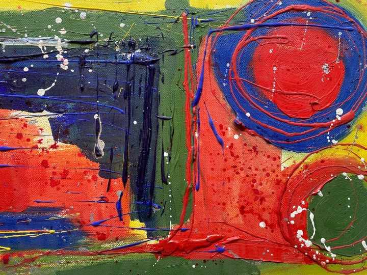
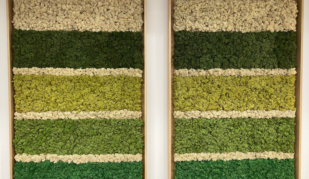
Header image – Author and artists own work.