Blog

50 and fabulous

50 and fabulous

I did love Joan Rivers, an iconic American comedian, actress, producer, writer and television host – a legend and truly iconic lady, she was known the world over for her characteristically dry, sharp, verging on offensive sense of humour. Of turning 50 she said, “Looking fifty is great – if you’re sixty.” There’s a popular saying that “Life begins as 50”, but does it? I recently had the privilege of turning 50. Some call it 40+10, some can’t say the number at all. For me, it’s easy to say but this life milestone has made me reflect on a few things.

“Looking fifty is great – if you’re sixty.”

Joan Rivers

A mix of emotions  

Whatever you want to call it; for those who have already joined the third quarter of their lifetime or the second half of their century, these words, expressions and feelings may resonate with you.

🧡 LUCKY to get to be 50, that alone is something to celebrate

🧡 REFLECTIVE that I’ve not ‘yet’ created the life that I thought I’d have by now

🧡 OPEN as to what I’ll create next, in life, my career, for travel and in love

🧡 GRATEFUL that I’ve experienced so much in such a short pace of time

🧡 EXCITED about starting a new chapter and next half century

🧡 THANKFUL for all the wonderful people and humans I have in my life, in the UK and abroad, and friends from decades ago and more recently

🧡 OVERWHELMED by all the beautiful messages, cards, flowers, gifts and experiences I’ve received as gifts

For all of these emotions, I’d like to say a big thank you to everyone, my heart is full.

Dance and sing like no one is watching  

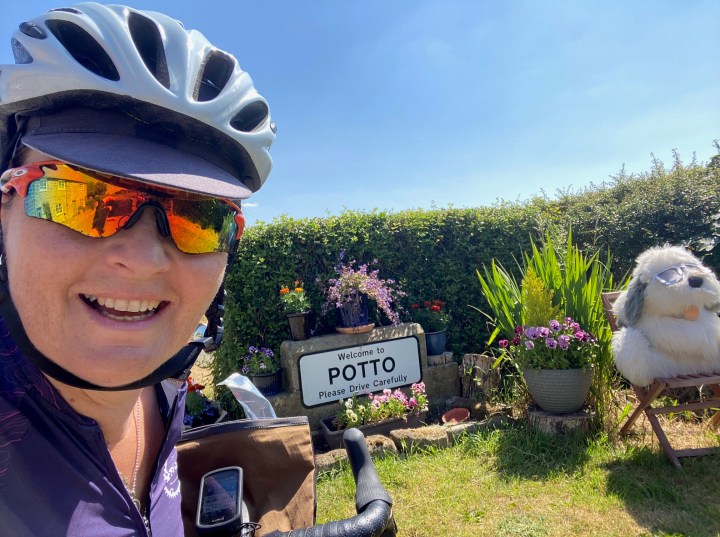
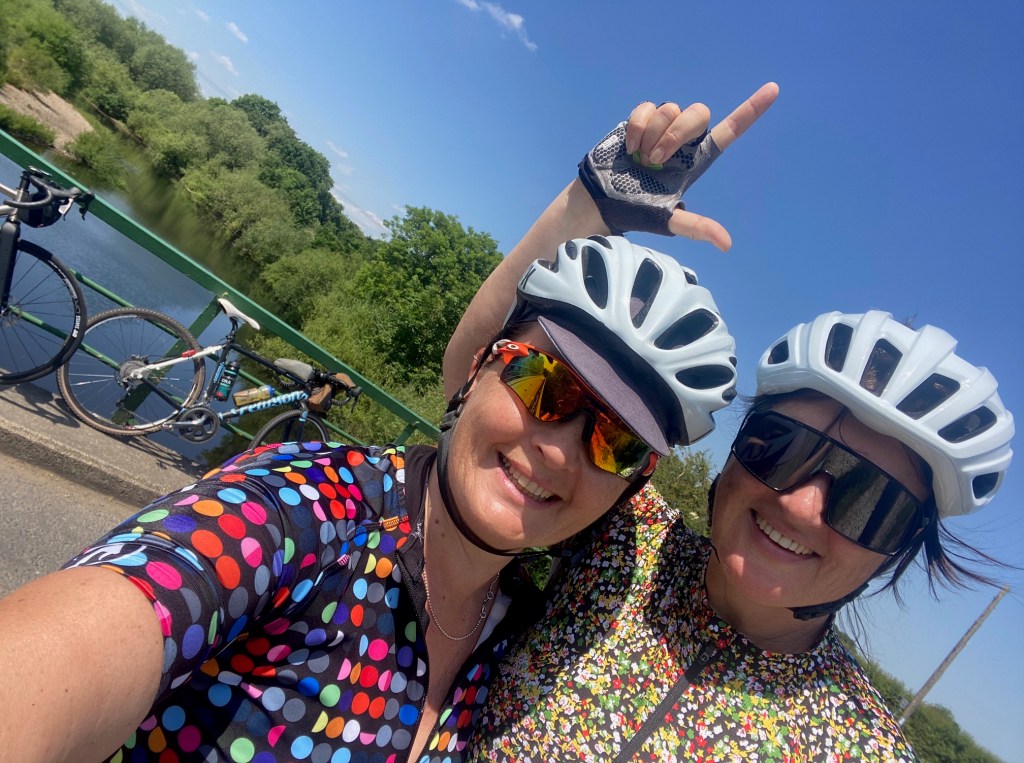
On my actual 50th I got up early and I cycled with a couple of girlfriends into the Surrey Hills. I appreciate it’s not everyone’s cup of tea, and for many it maybe a strange way to celebrate a milestone birthday, but for me it was perfect. A day immersed in nature with biblical rain – it was torrential, we actually needed a snorkel, mask and a wetsuit – and being totally soaked through to the skin, and shivering whilst trying (and failing) to fix a puncture (the second of the day), we still managed to smile, laugh, chat and sing. We even danced by the roadside to keep ourselves warm. The passers-by did give us some funny looks but I guess that’s one of the many brilliant things about turning 50, it’s the tremendous sense of liberation – I don’t seem to care what other people think about me these days. This sense liberation makes me think of the song FROZEN – Let it go! My nieces loved this track and it holds many happy memories seeing them dance and sing without a care in the world.

Time to shine in my next chapter  

So, what’s the point of me sharing all this with you? I guess it’s to say, I’m grateful and thankful for everything I’ve experienced so far – the good, the bad, and the ugly. It’s all a lesson. With my curiosity dialled up to 11 out of 10… I’m excited and looking forward to the next chapter in my life.

Some people have asked in recent months what I’m doing to celebrate and mark my 50th, “Are you having a big party?”, but that’s not my vibe. My thing is seeing family and friends in smaller groups, at different times, doing different things so we get to spend quality time together.

To that end, I’ve been celebrating with friends and family since the last weekend in Oct and will continue to celebrate every weekend into Nov and Dec. In fact, I’m now continuing into 2024 as many of the gifts I’ve received are experiences to be shared in the months ahead – you all know me so well. From high teas at The Shard, wild sea swimming weekends, forest yoga in Dorset, exhibition tickets to Hockney in London, and immersive colourful pot planting garden days in the countryside – turning 50 is the gift that keeps on giving.

Let’s talk – colourful conversations

Whatever stage you’re at in life, I hope you’re experiencing it all – the elation of the highs and the dips of the lows. Much like the journey of growth we experience when coaching or being coached, the line is never straight, it has lots of wonky bit, spiky bits, curved bits, light joyous bits, dark shadowy bits, and a host of lessons in between if we’re prepared to listen, treat ourselves with compassion and be curious.

As a brand strategist, colour consultant and coach, I work with heart-led people and businesses who are looking to make a positive impact in the world. If you’re looking to stand out from the crowd and distinguish your brand for all the right reasons, do get in touch, I’d love to talk.

With joy and colour,
Emma 🧡

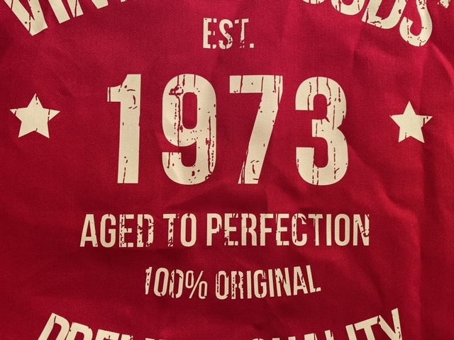
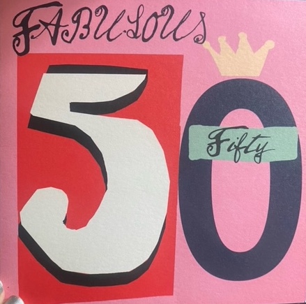
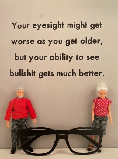
Images are of my birthday cards (excluding the rude ones), all are utterly brilliant!

Let’s change the rules

Let’s change the rules

If you follow me, or know me, you’ll know I have a passion for colour – in particular I love orange! To demonstrate my love and passion for orange it’s influenced many purchases and also influences the gifts I’ve received from friends and family over the years. For example, my Orbea carbon bike frame was orange, a glass antique vase salvaged by my mum in a Brocante in France is the most gorgeous rich orange, a light orange cotton bathing towel gifted to me by my sister (it also doubles up as a scarf if chilly on a summers night), a vintage burnt orange silk neckerchief gifted to me by my parents, and an Anorak reusable organic cotton bag with a beautiful retro flower print on it. The last product mentioned here combines several things I love – the colour orange, nature with the floral print, and being kind to the planet as being a reusable product, it helps removes the need for single use plastic bags.

Dial up joy, optimism, love, passion and life  

So why am I banging on about orange? In June this year, Italian car manufacturer FIAT announced that it will no longer offer grey cars as it wants to make our lives more colourful. In the FIAT | Operation No Grey campaign, a key part of the narrative and storyline told by CEO Olivier Francois, is based on joy, optimism, love, passion, and life told through the joy of colour, he explains why FIAT look the decision. He states “The world doesn’t need another grey car. So, let’s change the rules”. A closing key message in the campaign reads “Italy, the land of colours”, “FIAT, the brand of colours”. It’s clear here that FIAT wants the absence of grey to become a “distinctive feature of FIAT’s cars in the automotive market”. Therefore, from June 2023, FIAT will no longer produce grey cars.

To my surprise, the spectacular campaign footage featured a grey FIAT car being dipped into a vast drum of orange paint – yes, my favourite colour! The stunt took place in the Italian city of Lerici, during the summer solstice on 21st June, 2023.

Congruent with FIAT defining themselves as ‘the brand of colours’, they have a wonderful way of naming their colour range, all celebrating and referencing FIAT’s country of origin; for example, colour names include Venezia blue, Passione red, Sicilia orange, Gelato white. I love their passion for colour. Perhaps my next vehicle needs to be an orange FIAT to spark more joy, optimism, love, passion and a zest for life out on the open road?

You can watch the campaign HERE.

Don’t look at me, I want to blend in  

In the automotive industry, did you know that grey is the most popular colour for new cars registered in the UK, according to the Society of Motor Manufacturers and Trade (SMMT), June 2023. Over the last decade or so I’ve really been intrigued as to how grey become so popular, particularly as it’s a colour that has no positive psychological attributes.

To me, grey says blend in, don’t stand out, don’t look at me, I want to stay hidden. Like a battle ship on the ocean hiding from the opposition, or a person wearing a grey suit in to work to blend in with their counterparts in the city, grey is a colour that almost wants to be invisible.

I suppose you could say that grey is safe, it’s middle of the road – pardon the pun as we’ve been talking about the automotive industry and FIAT banning grey from its range. It’s neither black nor white, but I find it rather emotionless and find it dulls any feelings of creativity, which is most likely why I steer away from it as it dampens my positive energy and zest for life.

In 2011, the Guardian published an article titled ‘Why has everything gone grey?’ – and let’s face it, grey has dominated many areas of our lives from interior design to fashion and the clothes we wear. I wonder if this new more championed direction to celebrate colour and the psychological attributes of colour is a response to the challenges, we have all faced in recent years? Perhaps it’s a global response and desire to collectively feel more joyful, happy, optimistic and positive as we flow into the coming years.

Of course, colours and trends come and go, but I do hope that celebrating colour, in the many ways it can be utilised – in our lives, homes, cars, wardrobe, down to the brands we interact with – is here to stay.

Facts about grey 

When you look at the ways in which we might related to the colour grey personally, culturally, and psychologically, is it any wonder FIAT made this decision to ban grey from their colour range? Some insights and facts below:

  • It is a neutral or achromatic colour, meaning literally that it is ‘without colour’, because it can be composed of black and white
  • The first recorded use of grey as a colour name in the English language was 700 CE
  • In military uniform soldiers commonly wore grey to be less visible
  • The German Army chose a colour called field-grey, specifically to be less visible at a distance
  • In the 1930’s grey became a symbol of industrialisation and war
  • Grey is rarely used by political parties as it’s commonly associate with conformity, boredom and indecision
  • In design, grey is often used in fonts and headers to appeal to a mass audience
  • Grey is a type of camouflage… it conceals, it hides, it doesn’t want to be seen, it wants to blend in with its surroundings and not stand out

Let’s talk – colourful conversations

When do you find yourself wearing grey or being attracted to grey? Or are you drawn to orange? As a brand strategist, colour consultant and coach, I work with heart-led people and businesses who are looking to make a positive impact in the world. If you’re looking to stand out from the crowd and distinguish your brand for all the right reasons in your marketplace, do get in touch, I’d love to help you develop your brand strategy.

With joy and colour,
Emma 🧡

Header image courtesy of Pixels – Anton Ivanov.

The power of PINK – It’s a Barbie World!

The power of PINK – It’s a Barbie World!

When I was growing up, I was a tom boy… I was outside in the garden, climbing in the trees, building base camps in the woods, making swings and climbing ropes in amongst the trees. I was not a Barbie girl – Barbie was for girlie girls, not girls that rebelled against wearing a dress and preferred to be outside in nature getting muddy. Now as an adult, have my preconceived ideas of Barbie changed?

Behind the scenes on Barbie  

This week I listened to a Woman’s Hour – Radio 4 podcast, where I heard a conversation between the presenter Anita Rani, and two key women behind the scenes on Barbie – set director, Katie Spencer and production manager, Sarah Greenwoood – where they talked about how they created and set the scene for Barbie in a UK film studio, in winter, in Watford, Northwest London.

Just in case you’ve been under a rock, Barbie is a 2023 American fantasy comedy directed by Greta Gerwig; the movie features Margot Robbie as Barbie and Ryan Gosling as Ken (swoon), and heavily features the colour pink!

As part of the creative process, they created over 100 pinks from salmon pink to dark purple pink, and during that time discovered the sweet spot and defined their unique, highly pink colour palette for the movie. Working with Rosco, a company who specialise in products for the entertainment industry, they ordered 200 litres of pink, causing a global shortage of pink paint!

They went on to say that film-sets are often dark and mysterious; however, Barbie was different. In the podcast they touched on how influential light and colour was on set, commenting “You walk in and you’re into this amazing bath of colour and light, and it really was a therapy. It really was, it just glowed. It was like pulling you in, into this studio. In that sense it was really joyful.”

Keen to hear more? I highly recommend having a listen – Woman’s Hour, Radio 4 – HERE.

Fun facts about pink  

  • Baker-Miller Pink was known for temporarily reducing hostility, violence and aggressive behaviour, and has been used on the walls in psychiatric wards and in prison cells to calm inmates and pacify prisoners
  • Throughout most of the world, pink is considered a feminine colour
  • Madame de Pompadours favourite colour was pink
  • Pink became associated as a feminine colour post world-war II
  • In 2016, Rose Quartz was Pantone’s ‘Colour of the year’, known as millennial pink
  • Pink has been used to emasculate people and to make them feel physically weak, hence some football teams choosing the colour pink to paint the changing rooms of the opposing team
  • Global brands that have chosen to include pink in their logo include Barbie, T-Mobile, Tinder, AirBnB, and Dunkin Donuts (there are many more)

How I associate with pink – personally, culturally, and psychologically  

Personally, when I was young, I thought pink was very girlie-girlie. As a child it was not for me as I was very much a tom boy, always outside playing. Dolls and pink weren’t really part of my world – I don’t recall it being in my wardrobe either.

During my teens, the film Pretty in Pink was released which starred Molly Ringwald as Andie and Jon Cryer as Duckie. I loved that movie and unbeknownst to me it started to shift my perception of the colour pink. Andie made it cool, funky, and individual, because of her unique style and dress.

In my 30 and 40s, I have a very different relationship with pink. I have carefully selected items in my wardrobe that are pink – specifically a soft, muted dusky, dusty pink. Items include scarves, jumpers, a silk top (beautiful and timeless from Mint Velvet) and PJs (I’m a sucker for the leopard print ones from Hush – a lockdown purchase to make me smile). Moreover, two walls in my bedroom are painted in Rangwali Pink No. 296 from Farrow and Ball, it’s utter bliss – warm, cozy, kind, soft, yet strong and confident to.

Culturally and symbolically, I associate pink with hearts, romance, love, blooming peony’s, girls baby clothes. Even the saying ‘rose tinted glasses’ suggests everything has a warm, soft, attractive glow, designed to make us smile, feel good, and look at the bright side of life.

What’s your relationship and association with pink?

The influence of colour  

There’s no denying it, colour has a huge impact on our lives. As the ladies on Woman’s Hour advocate, the set made them feel joyful and uplifted. Colour can be utilised very effectively to change our mood, influence our behaviour, and impact how we feel. Some refer to it as colour-therapy, some call it colour healing, some don’t believe they associate with colour at all, but we do – we all do – some more consciously than others.

I love the fact that colour has the ability to influence every area of our lives, with its vibe, energy, light and frequency. It influences my life on a daily basis, to the clothes I wear, to the brands I’m attracted to, even to the food I eat and meals I prepare.

Back to Barbie

Are you going to see it? If yes, what draws you to it? If no, why not? Do you have any preconceived ideas about Barbie from your childhood? In all honesty, I never thought I’d go to a Barbie movie, but I’m curious. I want to see the set, the colour palette, I want to discover how it’s going to make me feel, I’m intrigued and open to having my past perceptions changed. Plus, who doesn’t love a fun, feel-good movie?

Let’s talk – colourful conversations

I’m a brand strategist, colour consultant and a coach, with over 20 years brand, marketing and communications experience. I work with heart-led people and businesses who are looking to make a positive impact in the world. Do get in touch to talk about and explore new perspectives.

With joy and colour,
Emma 🩷

Images courtesy of Pixels – Artem Podrez, Dids, and Carolina Grabowska.

Perception is everything – creativity is everywhere

Perception is everything – creativity is everywhere

Last week I had the pleasure of attending Mad//Fest London, a three-day marketing conference held at the Truman Brewery, East London. In fact, it’s held in the Truman Brewery car park which sounds a bit random, but it’s excellently organised and hosts some incredibly inspiring talks and brand challenges, especially on the brand innovation stage. The event is packed with hundreds of industry people and it’s a fantastic place to network, make new friends, be inspired by the range of speakers talking about some of the latest marketing trends and tech. Plus for me, provided a brilliant opportunity to catch up with lovely ex-colleagues and consultants that I’ve had the pleasure of working with over the past 20 years.

A fabulous, fast paced format, the brand innovation stage is where a household, global brand, in this instance Taco Bell will come to the stage with a real-life challenge and six providers will individually come to the podium to present their solution. It’s a bit like a quick-fire pitch ‘speed dating’ session where each provider has five mins to pitch their creative concept to address the challenge. At the end of the session, feedback on each concept is shared and a winner appointed. A truly educational and interactive session that spurs the imagination and puts a spotlight on innovation.

Due to client commitments I decided to attend day three, specifically to hear a Masterclass hosted by Rory Sutherland titled ‘Borderless creativity – is messy and that’s the way we like it’. For those that don’t know, Rory is the Vice Chairman of Ogilvy UK and founder of the behavioural science practice, he’s also a prolific writer, presenter and industry advisor. In the Masterclass he talked about magic, rational idea versus creative idea generation, and the need for a leap of faith.

Here are some nuggets and insights that caught my attention…

Get comfortable with being uncomfortable  

We all have the ability to be creative in every decision we make. Yet to be fully creative we need to acknowledge that there will be a period of messiness, a period where you don’t really know what’s going on and you don’t really know what’s going to result. But if we try to bypass this messy, disordered stage because it’s uncomfortable and causes tension, we miss the delight and surprise of the journey, and learnings from the process. In essence, to be creative we need to be comfortable with being uncomfortable. We need to learn to hang with the tension and let the creative process flow.

Hidden gems – discover the outlier  

During the creative process we may discover the findings or product that initially result are not what’s expected, and may not initially be considered a success, in fact they may fail and be considered a failure. Yet looking at a perceived failure with fresh pair of eyes and a fresh perspective may deliver different results. Shift your perception, look again, what can be perceived differently?

The example Rory gave here was about Night Nurse. Initially deemed as a failure because it made people feel sleepy if they took it during the day, it was then viewed differently with a fresh perspective, and pitched as a night time product to provide relief from cold symptoms and to help induce a restful and healing night’s sleep – thereafter the product was deemed a resounding success.

The accidental discovery of Viagra was another example of adopting a fresh perspective on a product. ‘The Genius of Accidents’ if you’re curious to hear more about the Viagra story, have a listen here.

Challenge accepted wisdom  

Gathering and analysing customer data is a critical part of understanding how your consumers behave, including what, when and where they purchase, however, it’s also important to remember that this data is captured in the past. Data most certainly has its place in telling a story and provides critical insight, especially when taken from multiple sources to build up an inclusive picture, but formulas don’t create magic in the same way the creativity process does. Rory states, “Rational decision making does not guarantee results, it’s not that formulaic”. I agree with this sentiment, as human beings we are constantly evolving, constantly changing, we don’t remain still, we are always seeking new experiences, new ways. He goes on to say “Averages are the enemy of the marketer. Look at the outlier data.”

As brand strategists and marketers, we understand the importance of data, yet we need to make space for magic. Robust decision making must involve some creativity, messiness and randomness. I appreciate using the word ‘randomness’ may be challenging as more often than not as people, and as business leaders, we want ‘certainty’ in our decision making, but certainty is an illusion.

We can only reason forwards when we have multiple data sets to review, but we need to remember that we can’t change the past, and you can’t make fully informed decisions based on the past. However, too reason backwards involves an act of imagination, to imagine different scenarios. This is subjective behaviour where you imagine different scenarios and what possible decisions brought you to this scenario. We don’t always know enough, so there has to be space for imagination and a leap of faith.

I believe, to find magic we need to tap into our inner wisdom. To step away from our head brain and into our heart brain, it’s our heart brain that’s creative and creates solutions.

Explore and exploit – the waggle dance

I’m sure many, if not all readers, are familiar with the 80/20 rule. Known as the Pareto Principle, this phenomenon was discovered by Italian economist and sociologist Vilferdo Pareto, and states that 80% of our results come from 20% of our efforts. He also noticed that 20% of plants were bearing the most fruit.

Interestingly bees do something called a waggle dance, where the worker communicates the distance, quality and nectar-rich flower patch to her fellow bees. Yet it’s been said that 20% of the bees ignore this communication and get creative, doing their own thing, and go off piste. What’s important to note here is that without the insight provided by this seemingly random behaviour of 20% of the bees, the hive would not survive.

From a business and marketing perspective, we need to spend 80% of our marketing budget to exploit what we already know and 20% to explore. How do you allocate spend to make space for magic?

As Rory commented, “Start with psychology and behaviour, not economics”. And as I would add, “Start with nature, it always has the answer”.

Do something different – discovery of the new

On occasion throughout my career when presenting or talking about new or creative ideas, I’ve been told ‘that’s not how we do things here’ which makes we want to ask the question “How’s that working out for you?”. But most people are not prepared for such a direct response or question, particularly in challenging times. What they often fail to see is that the orientation of this question comes from a place of wanting to succeed, of wanting to explore and exploit, a desire to make space for magic – not simply accept the status quo.

I liken the Pareto Principle and the Waggle Dance to 80% of people that follow the rules and 20% of people that are considered renegades or difficult (I prefer tenacious and curious) because they don’t blindly do what they are told; they opt to challenge the norm, to challenge authority and what’s gone before.

Taking a conscious approach, what’s good to know is that to succeed we need both parties – the rule followers and the rule breakers. But we must acknowledge that success is driven by the 20%. Are you one of the creatives, the renegades, one of the people who create magic and alchemy?

Let’s talk – colourful conversations

Are you facing a challenge? Do you sense you would benefit from taking a different approach? What perspectives have you adopted so far?

I’m a brand strategist, colour consultant and a coach, with over 20 years brand, marketing and communications experience. I work with heart-led people and business who are looking to make a positive impact in the world. Do get in touch to talk about and explore new perspectives.

With joy and colour,
Emma 🧡

Images courtesy of Alexander Ant, Meruyert Gonullu, Pixabay and Igor Kamelev.

Bike, Hike, Swim – Discover a new comfort zone

Bike, Hike, Swim – Discover a new comfort zone

In a recent post, ‘Rejection is Redirection’, I touched on the subject of being made redundant and the benefits of taking a break to reset and refresh. With that thought in mind I decided to go away for a week and to drive up to the Lake District in my camper van, the objective being to enjoy a change of scene and pace, and with a view to disrupt my routine. In search of an immersion in nature and a digital detox, I was somewhat delighted to arrive at my first campsite in Great Langdale, just a couple of miles from Ambleside, to discover I had no phone reception. That meant no WhatsApp, texts, emails, social media, no phone connectivity at all… BLISS! I appreciate this would freak some people out, but I really found it joyful.

Being in nature is like soul food for me. Every day the volume of the birdsong in the campsite was dialled up to the max, every sound, every animal distinguishable by the sound it makes – both at dawn and dusk. I chose to stay in Great Langdale in a small National Trust campsite which is located in the Lake District National Park, a stone’s throw from Ambleside at the tip of Lake Windermere, for its remoteness. A welcome retreat from a hectic and stressful few months.

Fun fact – The name Windermere originates from a derivative of a tenth century Norse chief called Vinandr and the word Mere, means an Old English word for a body of water. Previous spellings include “Wynhendermere” and “Winandemere”.

Getting organised before I left home with GPX gravel bike routes downloaded onto my Garmin to save on phaffage, I was set for a few days gentle riding. Well, in reality there’s nothing gentle about gravel riding in the Lakes. Whilst there are many shared walking and cycling routes that run parallel to the narrow bendy roads that have great relatively smooth surfaces, you don’t have to go far do find some ‘challenging’ terrain! With 25% inclines and boulders the size of my head, I abandoned a few paths and rerouted (in short, followed my nose) back to more ridable territory – think more bike than hike.

During these rides I discovered the delights of Rydal Water. Located just south of Grasmere at the foot of Loughrigg Fell in the Rothay Valley, it’s the perfect place for a gentle dip and swim to take the edge of the 30-degree heat and cool down. I’m not a strong swimmer so it was handy to swim out to a little rocky island in the middle and take a rest before my return to the shore.

The joy of reading – a book  

In the evening after my pedals and swimming antics, with my phone out of action other than telling the time, I opened a book titled ‘Great and Precious Things’, yes, the paper variety, not the Kindle kind, and immersed myself in the print on the pages. Described as “a heart-wrenching story about family, betrayal, and what we’re willing to sacrifice for those who need us most”, it’s not my usual cup of tea. However, reading this book struck a chord with me. Why? Because the main female character ‘Willow’, like me, is an artist and she has a passion for colour and in the book, I read about how she uses colour in her life and her home, to enhance how she feels and her wellbeing.

Over the years I’ve purposefully chosen to read many books about colour, colour psychology, colour therapy, colour healing, but never have I picked up a book because the title caught my attention, to discover I share the same passions as the main character. This raised the thought that the more aware I become, the more synchronicities I become aware of every day. Discovering each one makes me smile.

Feel the fear and do it anyway

I appreciate this is the title of a very good book, but here I’m referring to doing something that takes me out of my comfort zone. Having whisked myself away from Langdale to see a good friend for a couple of days near Middleborough, I returned to the Lakes, but this time to Low Wray National Trust campsite. I’d chosen this one because it’s located right on the edge of Lake Windermere, the perfect spot for an evening swim and stretch after more, bumpy, twisty, gravel bike adventures.

So, taking myself outside my comfort zone, I hired a paddle board for two hours – TWO HOURS, and went out solo! What initially felt like it was going to be very long time, passed super-fast. I paddled down the lake towards Wray Castle with a tail wind so moved faster than expected. It took a little longer to paddle back with a head wind but I got to explore a different aspect of the lake and see different views, whilst also pausing half way to sit down and eat my ginger cake! Note of caution – sit down to eat when on a paddle board, especially if you’re a newbie.

Rediscovering the graffiti artist in me 

Whilst away I felt the urge to paint, so on returning home decided to get creative. I’ve not painted simply for the joy of painting for a while. Several years ago, I sold my paintings in a few galleries in the UK (London, Nottingham, Surrey, Sussex) and a small part of me told myself “You are not very good anymore so why bother?” But I knew I wanted and needed to paint, so I followed the whisper to get out a canvas board, splash on the paints, and got wiggly with pens, inks, glue, oil bars and much more. The result was a piece I gifted to a friend as a wedding present – two hearts – each representative of them. My hope was for the painting to capture their characteristics of being fun-loving, colourful, cheeky, loving, wild adventurers who have a zest for life, and to wish them many happy years ahead.

Do what you love, love what you do

I’ve taken these words from the wonder woman, in fact the wonderful woman that is Holly Tucker, OBE. For me this post is all about doing what I love, and loving what I do, whilst sometimes stepping outside my comfort zone. This includes riding my bike, being immersed in nature, painting and being creative, reading books and being inspired by the story that unfolds on the pages, travelling solo, going paddle boarding solo, and making stuff up as I go along – following my whisper and intuition.

I’ve noticed that as I become more aware of what I love as a person, I create more of what I love around me. Being able to be quiet, to quieten my mind is a super power. It’s funny that I crave quiet, but have also previously been scared of quiet. Now I embrace quiet, the meditative state that comes with it, the clarity of mind that follows, and the joy of the experience. Every day is indeed a gift and for every day I’m grateful.

And if ever you’re in doubt, remember we are all, each and every one of us ‘Great and precious things’.

With joy and colour,
Emma 🧡

Header image and body images taken by me.

Flow and Grow – Old ways won’t open new doors!

Flow and Grow – Old ways won’t open new doors!

This May saw a new beginning and a rather fabulous and inspirational visit to Clerkenwell Design Week. Known as the UK’s leading festival that celebrates London’s creative hub, l discovered open showrooms, workshops, talks and product launches hosted by some incredible designers, architects and creative businesses.

Optimism and change  

A joy to visit, I had the opportunity to join a raft of inspirational panel sessions covering a wide range of topics including ‘Diverse and Inclusive Workspace Design’ hosted by Women in Design, to ‘How can design drive optimism and change’ hosted by Solus where the panel included graphic artist, Anthony Burrill; Colour Design Expert, Justine Fox; and Rob Delius, Architect and Head of Sustainability, Stride Treglown.

In line with the flow of the conversation in the ‘How can design drive optimism and change’ panel session, I’m in agreement that colour moves through communities and changes through the decades, the meaning of colour changes depending on the culture and country, and that colour symbolism is learnt. I also agree that knowledge is power. “It’s more important than ever that we educate people about colour and about how we are able to use colour beyond aesthetics” commented Justine Fox. We need to ask what we want colour to do – how do we want people to feel, what emotions do we want to evoke, what actions and behaviours do we want to elicit. Colour does influence how we behave in a space, interact with a product, and connect and engage with a brand.

One of the aspects I love as a brand strategist and colour consultant, is to challenge the idea of colour and to educate people about what’s possible when they understand the psychology and power of colour. Moreover, how they relate to colour personally, culturally and psychologically. From a new foundation of knowledge, a new awareness comes forth.

Biophilic design

To be inspired by colour there’s no better place to look than Mother Nature. You’ll discover a full spectrum of colours along with textures, tones, finished, materials, a spectrum of organic shapes and sizes, and much, much more to inspire you.

I love being in nature and I’ve always been drawn to biophilic design – a return to nature is calling. I appreciate biophilia is not a new concept, but I love the fact that it’s seeing a resurgence in popularity, in both the residential and commercial world of design. Just like a river, trends ebb and flow, yet, when we combine biophilic design with other current trends such as colour psychology and sustainability (and promoting a circular economy), a powerful combination is formed.

One of the products that stood out for me at CDW were the natural preserved plants and mosses presented and showcased in several of the showrooms, including Orangebox, Greenmood, and Old Sessions House. Some installations were standalone pieces of art, some were used to separate spaces, and some integrated lighting into the concept, yet all were sensual, experiential and induced the most wonderful feeling of connectedness. The majority of the pieces I saw had been preserved to hold their colour, feel, texture, and smell, providing a full sensory experience – I loved the earthy natural smell they delivered. I was mesmerised by them and started hatching plans about where I’d feature this kind of product in my home to further help bring the outdoors in and create a sense of calm and wellbeing.

Greenmood – Design Collection

Colourful conversations 

An avid learner, I enjoyed soaking in the pearls of wisdom the designers, architects and specialists had to share. During CDW they all gave so generously with their time and knowledge inviting people into their showroom spaces. In the coming weeks I’m excited to continue colourful conversations with many of the people I had the pleasure to meet.

To close, I’m going to leave you with a couple of quotes to ponder…

“It’s all about community, connection, and reacting to the world around you. Work hard and be nice to people, pass on kindness. The key to a happy life is to be nice and be kind to people.” Anthony Burrill

“Old ways won’t open new doors!”

If we want something new, we must be prepared to do something new. Here’s to driving change for the benefit of all, paying it forward, being kind, and new beginnings!

Are you are curious to discover more about how you personally relate to colour and the possibilities it brings? Do get in touch. I’d love to talk with you.

Header image and body images taken by me.

Rejection is redirection

Rejection is redirection

Let’s face it, for most people, being made redundant is not easy and it is often incredibly stressful. There’s fear of the unknown, it feels like rejection, it feels like you’re not good enough, it can feel embarrassing to talk about. Yet it happens to many great people, including me.

The truth of the matter is, rejection is redirection. I love this saying. I find it helps to accept a situation for what it is, it has helped me to reflect and appreciate the lessons learnt, and to embrace a new chapter that is gathering momentum.

Navigating change 

Chaos serves a purpose in our lives and it’s important to recognise this – it’s uncomfortable, it’s messy, yet it’s an opportunity to pause, reflect and to see things differently, to see a new perspective. It’s very easy to stay with that we know, to be ‘comfortable’, even when it is a dysfunctional pattern and structure that doesn’t serve us. Of course, it’s great to feel ‘comfortable’, we often seek ‘comfort’ in many ways – being with friends, in food, in escape watching movies, yet ‘comfort’ is not where growth happens.

In this state of flux and to help me navigate this time of change, I’ve asked yourself some questions…
• What am I resisting?
• What’s my souls’ vision?
• What makes me happy?
• Whose life have I enriched apart from mine?
• What legacy do I want to leave behind?
• What gifts, talents and abilities do I have to share?

Being made redundant creates a chaotic environment and requires us to navigate change. In the ultimate reframe – it is possible to look and appreciate this situation as a gift in disguise.

Here’s what my redundancy process has taught me…

Resilience

I’m way more resilient than I gave myself credit for. I’ve sat ‘in the mud’ and felt sorry for myself on occasion. Yet I recognise it’s important to feel my emotions and embrace them fully to be able to move on.

People

I have an amazing network of brilliant, inspiring, and kind people around me, in both my professional and personal life and for that I’m extremely grateful. You’ve all been so supportive and listened when I’ve needed to talk.

Nature

For me, being in nature is an extremely important environment for healing, for quiet, for acceptance, and for growth. A daily dose of nature clears my head and refuels me for the day ahead.

Pause

Take a break, if possible, book a mini get-away, enjoy a change of scene at home or abroad, it works wonders and has given me clarity. We are all creators and co-create experiences all and every day.

Play

I’m an artist, I paint and create for pleasure, and I’m extremely lucky to teach groups of people to paint a plethora of things from Highland Cows and Zebras to night scenes of Paris and Venice. Being creative and sharing my artistic skills fills my heart with joy.

New beginnings

To everyone in my network, and others I have yet to meet, I hope you’ve found reading this post empowering. And if you ever find yourself being made redundant, know that ‘rejection is redirection’. Reach out to your friends, reach out to your network, recognise the importance of play, take a break – you’ve got this!

And if you’re feeling a little stuck, remember, your track record for getting through challenging days is 100%, that’s always worth celebrating. Silver linings are everywhere, open your eyes and notice them, appreciate them. Celebrate your success.

To everyone I’ve had the pleasure to work with – Thank you for being amazing colleagues.

To everyone I’ve yet to meet – I’m looking forward to what we’re going to co-create together next!

A new chapter has begun!

Header image by Pexels – Scott Web.

Colour of the year 2023 – Viva Magenta

Colour of the year 2023 – Viva Magenta

Every year the Pantone Colour Institute announce a colour of the year to engage colour enthusiasts and design communities all over the world. As an avid lover of colour, with a keen interest in brand, design and behavioural colour psychology, I’m fascinated to understand why Pantone chose ‘Viva Magenta’ for colour of the year 2023.

Described by Pantone as an ‘unconventional shade for an unconventional time’… ‘a pulsating red shade whose exuberance promotes optimism and joy’, I get a real sense it’s putting a full stop on what’s gone before and is opening a channel to a new path of positivity. And quite frankly, after the last few years, who isn’t seeking a magical period of time fuelled by good vibes. Viva Magenta certainly does stand out in a crowd as a bold, fearless, and brave colour designed to capture our imagination.

#magentaverse 

Pantone talks about Viva Magenta as a colour that ‘straddles the physical and virtual world, evocative of our multi-dimensional world’. #magentaverse – a play on the metaverse. At present, the world we live in does increasingly span both the real and virtual, which can be challenging at times. And whilst I have a virtual presence online on social channels, my preference is for real – real people, real situations, real conversations, real colour.

Viva Magenta in action

Colour has the power to change our state, elicit new or different behaviours, and drive action. From a psychological perspective, red affects us physically and will always trigger a physical response. It relates to strength, courage, rebellion and says ‘Look at me’. Red is often considered a powerful colour that not only makes us feel empowered, but can also stimulate and help us tap into a new level of stamina to complete a task, or ready us to be that little bit stronger when required. A bit like caffeine, red is powerful and gives us a real boost of energy. I liken this to what happens to me when I drink a can of coke or enjoy a freshly brewed americano – it’s like I’ve been given a new lease of life, a superpower strength.

Do you see Viva Magenta is a shade of pink? Pink is typically understood to be nurturing and caring, particularly when you think about baby or dusty soft pink. In contrast, strong cool pinks like Magenta are very red are physically stimulating. For me, Viva Magenta comes across as quite feisty, full of fight and personality. It’s likely to be a colour that will call and connect with people who have a rebellious spirit.

Pantone express Viva Magenta as…

“Powerful and empowering, an animated red that encourages experimentation and self-expression without restraint; an electrifying, boundaryless shade that is manifestly ‘out there’ as is a stand-out statement”

“A nuanced crimson red that presents a balance between warm and cool. A hybrid colour that comfortably straddles the physical and virtual, evocative of our multi-dimensional world”

“A transformative red tone capable of driving design to create a more positive future”

Colour in nature

When it comes to colour, I believe that everything stems from nature. Just as Viva Magenta originates from a natural dye, it’s easy to see that nature provides us with a natural colour palette. It also provides us with shape, texture, form and context.

If you’re looking for inspiration, a great starting point is to go for a walk into a forest or garden. Look around and observe what you see, really become aware of the colours and textures all around you. And as the year goes on, bathe in the seasons and ‘feel’ into the one that resonates with you most, become aware of how all the colours harmonise with each other, a colour palette will appear before your eyes.

However you choose to embrace and weave Viva Magenta into your life this year, may it empower you, draw out your assertive side, and encourage you to be a little bit more audacious, every day.

Header image by Pexels.

Completion on 2022 and Creations for 2023

Completion on 2022 and Creations for 2023

There’s often a big rush as December comes to a close, and January and a new year starts, to rush into making new year’s resolutions, which when made we’re super passionate about, and feel confident and committed to. Only to discover three or four weeks or months down the track that our passion has vaned, our confidence in being able to stick to them has almost evaporated, and our commitment has been replaced with apathy. I’ve been there many times and have experienced exactly this, so to save myself the distress and disappointment of not being able to stick to new year’s resolutions, about 10 years ago I decided not make them anymore.

Historically, my resolutions were rather vain, something along the lines of get fit, go on a diet, drop a dress size – all rather external and not very inspiring, which is probably why I didn’t have the will power or commitment to stick to them. Knowing what I know now, they’re also very ‘head’ lead and not ‘heart’ felt.

Introduction to Completion 

So, with resolutions behind me and a desire to find a new way of moving forwards, I now commit to a completion process at the end of every year. It’s a simple practice learnt from my experiential and intuitive trainings with a rather brilliant coaching company called Natural Success. For completion I simply ask four questions:

• What did you create good and bad?
• What did you learn good and bad?
• What are you over?
• What will you create next?

I love this process as it’s a bit like a hot knife through butter. The questions are direct, they enable you to get straight to the point, and invite you to step right in to the juicy bits.

Over the past few years, I’ve hosted a completion process online on Zoom for friends who’ve been curious to take a different approach to making resolutions. At the beginning of completion, I usually make brief introductions to ensure everyone feels comfortable, do a short meditation for 5 minutes or so to bring everyone together energetically as we’re often in different locations and countries, and from hear lead into the questions asking everyone to respond intuitively. This really is key, to respond to the questions intuitively and not over think anything, to tune in and go with what you receive – it’s a time to be open and go with the flow.

For each question I usually suggest you write for 10 minutes to capture what you receive, then invite everyone to share a couple of things that came up for them in the 5 minutes that follow. The beauty of everyone sharing is we get the opportunity to vocalise our insights and identify synchronicities that arise in the group; it also helps people to concretise and get clarity on their vision.

What do you want to create in 2023?

If you’re curious to experiment with a different approach to making resolutions, I whole heartedly invite you to give yourself the gift of completion. There’s magic in the process and it often sheds a light on something that would otherwise go unnoticed and undiscovered, yet when written and heard sets you off on a new journey, full of desire and intention.

For me, the results of my completion were love, joy, fun, and play – in abundance.

On that note as we step into 2023, may our hearts be open to receive, and may we embrace with open arms all that is meant for us.

Green heart shaped leaf image courtesy of Pexels and Pixabay.

The Joy of Colour – Mother Nature leads the way

The Joy of Colour – Mother Nature leads the way

Perhaps it’s autumn and the colours that are in the trees, but I absolutely LOVE this time of year! It’s a time when Mother Nature burns with delight, turning leaves to many shades of gold, orange, red, burnt umber, maroon, pink, yellow… there are so many colours to mention. It’s also a time when she lets go of the dead leaves that glowed a luscious green all summer, realising it’s time to transform and return the leaves to the earth where they re-join the soil. For me, autumn is a time to take a rest after a busy fun filled summer, to re-coop and recharge my batteries throughout the winter season that follows, to ensure I have energy for spring and the year ahead. In contrast to letting go, there’s a natural colourful harvest to gather, pumpkins to pick, squashes to stew, cook and enjoy. Maybe turning fruits and vegetables into pickles to gift to neighbours is your thing, or to dollop it generously on a piece of cheese when dining with friends at home, there are so many things that spark joy.

Nature and colour  

Now, why am I rambling about Autumn…? I believe it’s a time to be still, reflect on what’s been, enjoy what’s around us, and to be present in nature; it has so much to teach us about living, being in the now, and transforming from one form to another – season by season. Effortlessly, quietly, Mother Nature gets on with her business every day, 24-7, not asking for praise or recognition, she quietly does her thing.

In recent years I’ve come to understand more about nature and how it relates to colour. And how colour impacts how we feel, how we behave, and how it can be used to raise our vibration to bring comfort and tranquillity, or at the opposite end of the scale to create a sense of discomfort, even anger. Subconsciously we all relate and connect with colour in many ways, it influences our decision making when we choose clothes to purchase, our choices in the way we dress every day, and how we choose to decorate our spaces – be that an office, café, hotel, or home environment. Discovering how I relate to colour has made a huge difference in my life, my wardrobe, and in my home. Before gaining this awareness, I often felt a disconnect with some colours but not others, and now I understand why. Understanding my colour personality and how it relates too nature has been a guiding principle in all my choices and purchasing decisions when it comes to colour – and I’m keen to share this with you so you can apply it in your life.

Colour in motion: Thoughts, feelings, actions, behaviour

Just as colour has the ability to influence and change our behaviour, so do our thoughts. Have you noticed that patterns and behaviours have emerged over your lifetime? But where do these patterns and behaviours come from? Following my natural curiosity and passion for personal development I’ve discovered that thoughts become things – thoughts create feelings, feelings drive action, and a repeated action becomes a behaviour – and thus over time a pattern is created. Of course, life experiences drive and influence our thoughts and I have to constantly remind myself that thoughts and feelings are not real. It’s not to say I didn’t experience them, I did, but they do not represent reality. They are my individual experience – it’s my lens, my focus, and my thoughts that create my reality. Your thoughts and your focus creates yours too.

So, what do you want to consciously create? As I was recently reminded, if we fill our bodies with excessive calories and food that is not nutritious, we generally start to carry additional weight. Just as if we fill our minds with thoughts that aren’t helpful, true, and don’t reflect reality, then our mind can get cluttered and heavy, and our focus gets distracted. From a colour perspective, the colours we surround ourselves with subconsciously influence our thoughts, feelings, actions and resulting behaviour. It may seem obvious, but it’s incredible how the influence of colour can and does influence all aspects and areas of our lives.

Colourful conversations in everyday life 

November is my birth month and what better way to celebrate than to share my joy of colour with a host of ladies at The Women’s Institute. I was invited some months ago to speak and I’m excited to be able to spread love. In my talk I’ll share a little bit about where my love of colour started, share some insights on how we relate to colour, how we communicate with colour – with a lens on well-known household brands, colour in nature – with a lens on the seasons, plus some discussion about inspiration being all round us.

If you are curious to discover more about how you personally relate to colour and the possibilities it brings, do get in touch. I’m passionate about understanding more about you, sharing the joy of colour, and helping you make it applicable in your everyday life.

Header image from Pexels – Pixabay