Ban Beige! Reflections & Creative Inspirations

Ban Beige! Reflections & Creative Inspirations

I love this time of year. There’s a crispness in the air, the trees turn a magical array of mellow yellow, fiery orange, golden brown and rustic red, and I find myself craving a hot chocolate and a good book. (I’m still reading Your Brain on Art: How the Arts Transform Us, it’s a wonderfully insightful read.)

Like many of you, I can’t quite believe how fast the year is moving; we’re hurtling towards Halloween and cruising into Christmas. But before stepping into those magical moments, I wanted to pause, look in the rear-view mirror, and celebrate a few personal highlights, it’s truly been a time of conscious creativity. Here’s my top three:

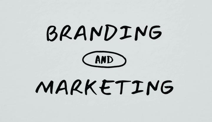
Colour as Your Brand’s Emotional Driver

In September, for BIMA, I hosted an interactive masterclass which provided brands and marketers with an immersive journey into the world of colour and behavioural colour psychology. Together, we explored how brands can use colour to stand out, connect, and communicate meaningfully with their ideal customers.

I welcomed a wonderfully diverse mix of attendees to the masterclass, from agency founders and heads of marketing to creative directors, designers, and content leads, representing brands as varied as Pernod Ricard and NHS Trusts.

We reflected on how technology and AI are powerful enablers of efficiency and scale, but they don’t feel, they’re not intuitive. AI can make colour theory digestible, but it can’t imagine. We also talked about how do we use the time gifted back to us by technology to dial up our authentic intelligence (AI) and emotional intelligence (EI)? How do we nurture our creative instincts, build empathy, and strengthen human-to-human connections?

The Q&A sparked fascinating conversations, especially around the colour grey, a tone I like to call “the one that hides in plain sight”. Think of grey battleships blending into the sea or field-grey army uniforms designed not to be visible at a distance.

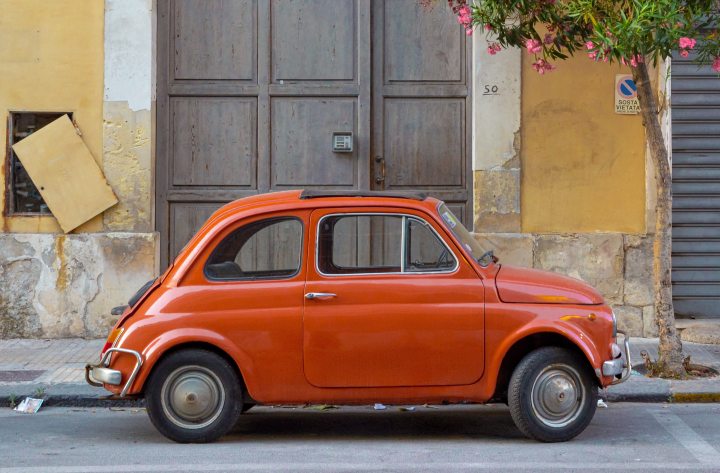
When showcasing the influence of colour, I shone a spotlight on the ‘Fiat – Operation no more Grey campaign’, and the surprising creative and influential use of pink on-set for the ‘Barbie’ movie.

I’ll be hosting future sessions that dig deeper into the language of colour and how it can powerfully connect brands with their audiences. If you’d like to learn more, I’d love to hear from you.

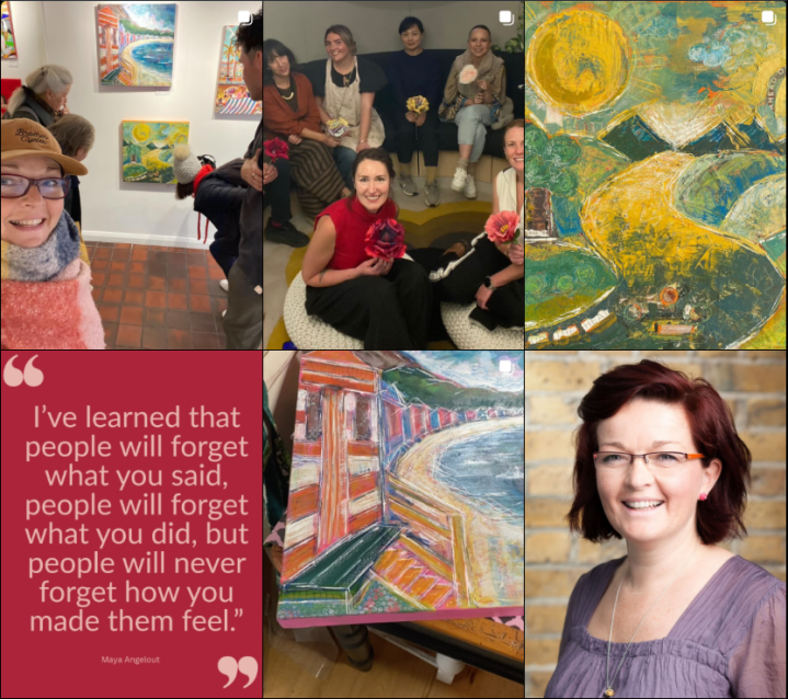
Colour & Creativity Workshops; hosting Designers and Architects

What a joy it was to collaborate with such brilliant minds in the interior design and architectural community to deliver my Colour and Creativity workshop. Thanks to Nordic Design House and Magda for inviting me and Cesca.

At its heart is a shared belief that creativity is more than just making something beautiful, it goes beyond the aesthetic, it could be considered mindfulness in motion. It’s a moment to pause, to ground ourselves, and to reconnect with colour, with others, and with our own imagination.

We explored creativity as wellbeing, and giving yourself permission to slow down, explore, and express, whilst building calm, confidence, and resilience through simple creative acts. Then we talked about our personal connection with colour, and how we can use the language of colour to communicate, connect and tell human stories.

This workshop is for everyone, not just “creatives.” I always invite attendees to come as you are, and leave with a renewed sense of joy and possibility.

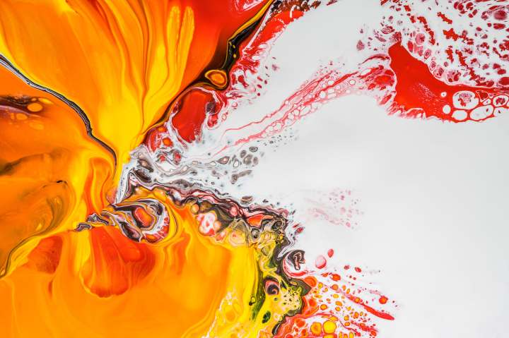
Behind the Canvas: Exhibition & Private Commissions

In September, I was honoured to exhibit alongside fellow artists from across the UK at Brighton Art Space, organised by The Paint Club. I created two pieces, one titled ‘Sunny Surrey Hills’ and the second ‘Nefyn Beach, Wales’. If you missed it, don’t worry, more exhibitions are on the way!

I’ve also been commissioned to create a very special piece for a client in Surrey, designed to capture the feeling and emotion of her late father. It’s a process built on trust, beginning with a 90-minute creative conversation to uncover the story behind the intuitive art.

As Pierre-Auguste Renoir said:

“Art is about emotion; if art needs to be explained, it is no longer art.”

Please do get in touch if you’d like me to create a bespoke, unique piece of art for you.

You can follow me on Instagram here.

Podcasts to Ponder

I love reading, but I also adore the feeling of being part of a conversation, which is why I’m a podcast devotee. If you’re feeling curious and are looking to immerse yourself in the language of colour, here are two I highly recommend:

Stories in Colour – The National Gallery

A vibrant series uncovering the hidden stories behind colour, from history to modern day, this podcast features curators, scientists, historians, and artists. You’ll never look at colour the same way again.

Let’s talk colour

Hosted by the wonderfully colourful founder of The Colour Authority, Judith van Vliet, this podcast features global colour specialists exploring design, psychology, trends, and the transformative power of colour across numerous brands and industries. Every episode inspires me to bring more colour into life and work. Discover more here.

Closing thoughts

Colour is more than what we see, it’s how we feel, connect, and create. The hues we choose can shift our mood, spark imagination, and shape the stories we share.

In a world that’s grown a little too beige, maybe it’s time to bring back the bold. Reintroduce colour, intentionally, thoughtfully, and with heart, into your life, your brand, and your work.

“Colour is one of the most important and powerful universal languages we have.”

Source: Alina Schartner, Design, Colour + Trend | Consultant + Strategist

Break free from beige. Let’s bring the colour back.

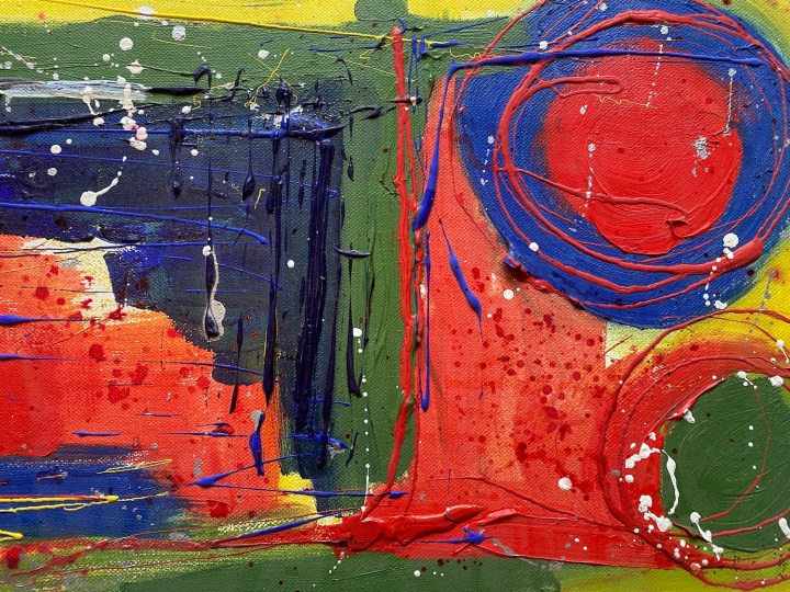
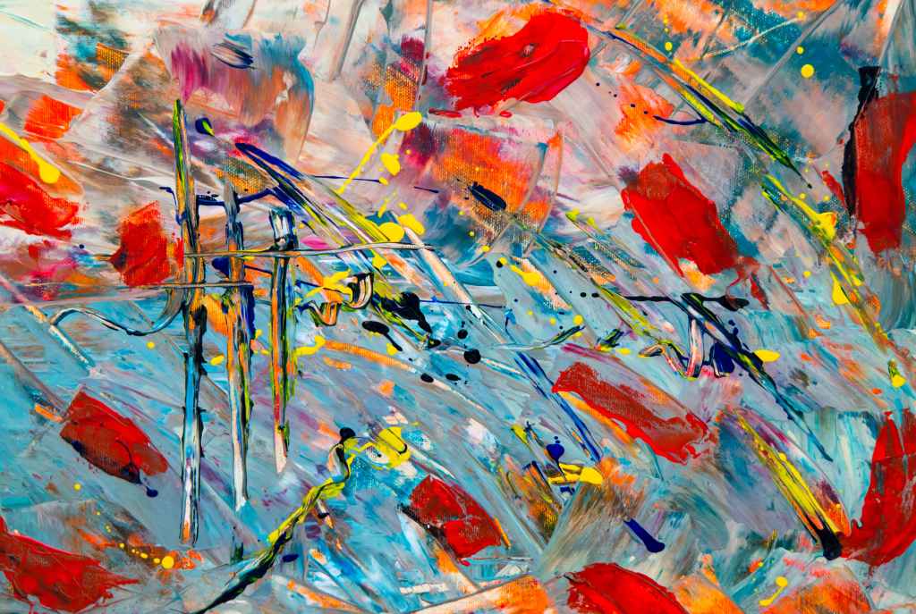
Header image: Colour and Creativity Workshop, September 2025.

Reignite your brand’s potential

Reignite your brand’s potential

Growing a business is no small feat, and I understand the challenges that come with it—whether it’s defining your brand, standing out in a crowded market, or building trust with your audience. I work with MDs, CEOs and founders of scale-ups, and SMEs to create brand strategies that truly connect. Together, we’ll align your brand with your market and audience, strengthen relationships within your team and with key partners, and develop practical solutions that drive real results. It’s all about creating authentic connections that boost productivity, profitability, and your business’s future potential.

As a seasoned brand strategist, I specialise in empowering businesses to unlock their full potential by crafting a compelling and distinct brand. By addressing common challenges like unclear messaging, inconsistent communication, and market saturation, I help brands achieve clarity, consistency, and differentiation. Whether you’re seeking to redefine your value proposition, create a cohesive strategy across all platforms, or refresh an outdated identity, I provide actionable solutions tailored to your goals.

Clear brand identity

  • Challenge: Difficulty in defining a brand’s value proposition and communicating it effectively
  • Solution: Develop a comprehensive brand playbook, focusing on core values, purpose, messaging, and creative assets to resonate with the target audience and establish market differentiation

Consistent Messaging and Brand Experience

  • Challenge: Inconsistent communications across online and offline channels, causing customer distrust and disengagement
  • Solution: Implement a cohesive brand strategy that ensures uniformity across all marketing and communication touchpoints, on and offline

Create Market Differentiation

  • Challenge: Struggling to stand out in a crowded and competitive market
  • Solution: Identify unique selling points (USPs) and develop a brand narrative that highlights differentiation while appealing to the target customer

Reignite your brand’s potential

  • Challenge: An outdated brand that no longer aligns with current goals or market demands
  • Solution: Guide your business through a rebranding and repositioning process to align your identity, messaging, and services with company values and target audience expectations

What does a Discovery Session look like?

To give you some insight into what it would look like to work together, following initial conversations and an agreed brief, our journey would begin with an immersive, hands-on one-day workshop designed to set the foundation for your brand’s future. This session brings together you and your senior stakeholders—and any key decision-makers you’d like involved—to ensure alignment from the start.

During this collaborative session, we’ll dive deep into your vision for the business, uncovering what makes your brand truly unique. Using a carefully crafted framework, we’ll extract your “brand DNA,” the essence that defines who you are and what you stand for.

I’ll guide you through a proven methodology to define your brand in detail. Together, we’ll explore:

  • Your brand purpose, values, and mission
  • Your tone of voice and overall brand essence
  • Gain clear understanding of your products and services
  • Uncover a detailed profile of your ideal customer—who they are, what they need, and how your brand connects with them

The discovery session is designed to be insightful, actionable, and empowering. By the end of the day, we’ll have laid the groundwork for a strategy that aligns your brand with your business goals and resonates with your audience.

Tackle challenges head-on

By addressing your challenges head-on, we will empower your business to craft a brand strategy that is deeply aligned with your market and resonates with your target audience. This strategic approach enhances market positioning, fosters stronger relationships both internally—with senior stakeholders and teams—and externally with suppliers, partners, and sponsors. The result? Actionable solutions that inspire authentic connections, fuel productivity, and drive sustainable profitability.

Together, we can reignite your brand’s potential and position it for continued growth in a competitive marketplace.

Let’s work together

With over 20 years of experience working with innovative and disruptive-tech businesses across a variety of sectors—from HRtech and digital to customer experience and interior design—I bring a blend of commercial acumen and creative thinking to everything I do. I’m a strategic yet hands-on leader with a passion for collaboration and an action-oriented mindset that delivers real results.

My approach is human to human, balancing the analytical left brain (facts, figures, and data) with the intuitive creativity of the right brain (emotion, imagination, and storytelling)—because I believe the magic happens when you combine these two key ingredients.

I’m especially passionate about growth, coaching, and the power of applied behavioural colour psychology. Get in touch to create something exceptional together!

Header photo by Eva Bronzini – Pexels.

Colour is emotion

Colour is emotion

Firstly, I want to say a big thank you to Modulyss for raising awareness of the importance of colour in design. In their most recent Modulyss Talks session, held yesterday 5th Sept, they discussed an interesting topic, ‘The Impact of Neuroaesthetics’ with Karen Haller, who runs a behavioural design consultancy.

For decades, over 30 years, I’ve been fascinated by colour and its impact on us mentally, physically and emotionally. It’s a subject that I’m hugely passionate about and it’s one I’m always keen to understand more of, not only to apply to myself, but also for my clients.

Having studied with Karen a couple of times over the past five years with a focus on colour and its application and use in brand and marketing, and more recently from a creative artistry stand point, I jumped at the opportunity to be ‘virtually’ with people who share my passion for colour, have a thirst for knowledge, and are keen to understand more about how they can use colour positively in our personal and professional lives.

For clarity, at the start Karen defined ‘What is Neuroaesthetics’ as the field within neuroscience, that explores how our brain perceives, processes, and responds to beauty, art and design. And that it’s NOT creating spaces that are just aesthetically pleasing, creating a wow factor, slavishly following trends, or pleasing the brain with a dopamine hit.

“Neuroaesthetics emerged in the late 1990s, and nobody is clear on who coined the term, but a simple definition is that neuroesthetics is the study of how arts measurably changes the body, brain, and behaviour and how this knowledge is translated into practice,” said Susan Magsamen, founder, and director of the International Arts + Mind Lab Center for Applied Neuroaesthetics at Johns Hopkins University School of Medicine.

Let’s dive in

Throughout the talk there were many refreshers about what I know already, but there are always some nuggets that stand out and resonate, or perhaps land differently, deepening my understanding. So, in the interest of sharing and spreading my love of colour and its application with you, here’s some key takeaways to ponder and reflect on.

Nuggets and takeaways

  • Colour has duality, both positive and negative
  • From a colour psychological stand point, it can influence our metabolism, appetite, body temperature, water regulation, sleep, autonomic nervous system, and even our sexual and reproductive functions
  • All colours drive and create a different energy, response and emotion
  • We don’t live in a grey world, we live in a colourful world
  • Grey hides things in plain sight, it wants to recede, to hide, it doesn’t want to be seen
  • When we think about colour, we also must consider pattern, scale, shape, texture and placement as they all interplay
  • The right colour in the wrong proportion won’t work
  • If it’s a colour, we’ll have an emotional response – neutral doesn’t exist
  • Colour isn’t just a visual stimulus, it delivers an emotional response

Target market

Wherever you’re using and applying colour, in your brand or your business; in all instances, understand your target market. When working with a client, always get clarity on their target market and audience, this will help create the desirable outcomes that your clients will want to see.

As Karen mentioned during the webinar, from an interior design perspective, in a hospitality interior design space, in a restaurant or café, imagine an environment that creates the behaviours your client wants to see – excited, relaxed and staying longer, talking, networking, dining, eating and drinking, and ideally turning into a repeat customer. In a workspace, depending on the brand and business needs, there will be a very different set of requirements.

Remember, when applying colour, make your KPIs measureable as we do want to know we’ve got things right; we can’t see or measure a mood or a feeling, but we can measure behaviour.

Unlock potential, create change

From a brand strategy perspective and in the projects I lead and get involved with, when a company is rebranding their colour palette will be an evocative and foundational point for discussion. Of course, a brand is much, much more than a colour palette, and that’s a topic I’ll touch on separately, but for now, remember, colour is emotion, it makes us feel something, and a brand will want to connect with its customers on an emotive, emotional level – not just sell its products and services.

I’m a very intuitive person and like to feel into and connect with what my clients want, which means really listening to what they say, and what they don’t. I also like to dig deep to understand their values, vision, purpose, what they want to create next for themselves, their teams and for their business. So, whether I’m feeding back following a 121-consultation process or a group brand strategy discovery workshop, I will back up my thinking with logic and information, not just a hunch.

Immersive memorable experiences

Fundamentally, colour creates immersive and memorable experiences. Humans are complex beings, we all have different needs and we all react and respond differently to our environment, be that at home, our work space, and when out socialising. What appeals to me, won’t appeal to everyone, and that’s a good thing – we’re all unique.

Let’s continue to use the power and application of colour to celebrate our differences, to build environments that encourage positive change, and build brands and businesses that are a force for good.

Have a colourful weekend!

Links for reference

  • Quote source – Artandobject – How art is scientifically proven to help brain health, Feb 2023
  • Discover more about Modulyss
  • Discover more about Karen Haller

Find your sweet spot

Find your sweet spot

In the past 18 months life has been pretty hectic and many things have changed, personally and professionally. I’ve been made redundant, I’ve moved house, I’ve renovated my home – from top to bottom, inside and out – so a bit of a makeover and transformation on both fronts; and I’ve also started contracting, making a conscious choice to specifically connect and work with businesses that are in a stage of growth.

Contracting and working in this way has given me a huge degree of flexibility to manage my time effectively and efficiently, ensuring I deliver what my clients need whilst also dedicating time to what I need for me – it’s a balancing act and it’s one I thrive on.

But what exactly do I do?

I’m a marketing, communications and brand specialist and I typically work with small and medium sized businesses that are looking to build brand awareness, drive growth, and create new revenue opportunities. Moreover, I have a desire to work with businesses that are people focused, are driven by their values and want to make a positive impact in the world.

Here’s what I’ve got

  • Experience – I’m a commercially and creative minded B2B marketing, brand and PR professional with 20+ years’ experience of working with innovative, forward-thinking and disruptive-tech businesses spanning multiple sectors including HRtech, digital, PR, mobile, customer experience (CX) and interior design
  • Knowledge – With an action and outcome orientated mindset, I operate at both strategic and tactical levels and I view myself as a collaborative and confident leader who inspires those around me
  • Holistic human approach – My approach is holistic, human to human, I believe in blending the creative analog right brain which calls for creativity, intuition, art, emotion and imagination, with the digital left brain that calls for facts, figures, data, analytical and logic – combining the two is where magic happens

Here’s what I can do for you

  • Brand strategy – I work with CEO’s, founders and MDs at start-ups, scale-ups and SMEs to help them achieve growth and build brand value
  • Marketing & communications – I help businesses define their marketing and communications strategy, create a narrative that delivers differentiation in their market, and engage with the right audiences
  • Coach and mentor – I’m a certified NLP Practitioner and Coach, I’ve studied various modalities incorporating traditional and experiential practices and applied behavioural colour psychology, I’ll coach and mentor your team to help facilitate change

Let’s talk

With a growth mindset, I understand that navigating change can be challenging and uncomfortable. Acting as your head of marketing or marketing director, I will help you fuel business growth by embedding marketing and lead generation processes that deliver results whilst also injecting a unique blend of creativity that unlocks your potential.

Think of me as your strategic partner and trusted advisor who delivers all streams of work on-time, to budget and my support comes with integrity, passion, and a smile.

If you are a founder, MD or CEO seeking to make a positive impact in the world, I’d love to talk with you.

Drop me an email – emma@emmapotter.com

Photo by Alex Rumford – You will find him on Instagram and LinkedIn

AI versus creativity

AI versus creativity

This morning whilst doing an early turbo session I re-listened to a Happy Place podcast hosted by Fearne Cotton, where she interviewed Take That’s Gary Barlow, Mark Owen and Howard Donald – I was transported briefly back to my carefree university days.

In the interview they talked about imposter syndrome, creativity and family, but it wasn’t until the last 5 minutes where they touched on the subject of AI. It’s a topic that I’ve talked about with colleagues and clients, touching on how it could potentially impact their business to how they can utilise AI in their business. From a personal stand point, I’ve played around with it and I understand the benefits – it can reduce human error, automate repetitive tasks and processes, smoothy hand big data – but I don’t believe it will replace creativity as it can only gather content from what’s already out there. It was great hear Gary’s view on AI.

“AI can’t come up with what I come up with next. All it can do is base its prediction on what I’ve already done.”

Gary Barlow

Key takeaways  

Listening to the broader conversation Take That had with Fearne, here’s some other takeaways that might resonate with you.

  • Do the thing that got you recognised, that you love, that speaks to your soul, not the thing that runs alongside it.
  • Ideas come from our creative genius. Flying solo is good, but greatness also comes from collaboration – it’s a combination of song writer, musicians, production, stage design and creative.
  • Spaces like recording studios have magic in them – we can feel it, like energy, we step into a space where our creative juices and ideas start to bubble up and ooze out.
  • Focus on the fire in your belly – if it doesn’t make you excited, and each-other excited, you don’t have anything. Be led by Love, be inclusive, and above all, be who you want to be.
  • Family is everything; it’s having the right group of people around you, not just ‘yes’ people, we need people who are going to say ‘no’ so we can have an honest dynamic conversation.
  • Put your phone away – don’t leave it face down in the table, put it away, out of sight, out of reach. This will help you be fully present in the moment.

If you fancy having a listen, click HERE.

Imposter syndrome and doing what you love  

It was interesting to hear the band talk about coping with fame. The contrast of feeling not worthy, then blocking out adoration to be able to cope. It just goes to show you never really know what’s going on behind closed doors, we all wear masks at points in our lives to conceal our insecurities.

“Go back to the thing where people first noticed you… don’t focus on fame, focus on your soul skill. Focusing on the partner to that skill will get you lost. Keep going back to that well, that’s the real reason you’re here.”

Gary Barlow

I love being surrounded by people who are creative, where there’s a mutual exchange of energy, where we fuel and inspire each other – it currently doesn’t feature AI. Will it in the future? Possibly on the data front. Creativity however, will always originate from your intuitive creative genius.

What’s the soul skill you bring into the world? Where’s your Happy Place?

Let’s talk – colourful conversations

As a brand strategist, colour consultant and coach, I work with heart-led people and businesses who are looking to make a positive impact in the world. If you’re looking to stand out from the crowd and distinguish your brand for all the right reasons, do get in touch, I’d love to talk.

With joy and colour,
Emma 🧡

Images sourced from Pexels – Steve Johnson and Alexander Ant.

Let’s change the rules

Let’s change the rules

If you follow me, or know me, you’ll know I have a passion for colour – in particular I love orange! To demonstrate my love and passion for orange it’s influenced many purchases and also influences the gifts I’ve received from friends and family over the years. For example, my Orbea carbon bike frame was orange, a glass antique vase salvaged by my mum in a Brocante in France is the most gorgeous rich orange, a light orange cotton bathing towel gifted to me by my sister (it also doubles up as a scarf if chilly on a summers night), a vintage burnt orange silk neckerchief gifted to me by my parents, and an Anorak reusable organic cotton bag with a beautiful retro flower print on it. The last product mentioned here combines several things I love – the colour orange, nature with the floral print, and being kind to the planet as being a reusable product, it helps removes the need for single use plastic bags.

Dial up joy, optimism, love, passion and life  

So why am I banging on about orange? In June this year, Italian car manufacturer FIAT announced that it will no longer offer grey cars as it wants to make our lives more colourful. In the FIAT | Operation No Grey campaign, a key part of the narrative and storyline told by CEO Olivier Francois, is based on joy, optimism, love, passion, and life told through the joy of colour, he explains why FIAT look the decision. He states “The world doesn’t need another grey car. So, let’s change the rules”. A closing key message in the campaign reads “Italy, the land of colours”, “FIAT, the brand of colours”. It’s clear here that FIAT wants the absence of grey to become a “distinctive feature of FIAT’s cars in the automotive market”. Therefore, from June 2023, FIAT will no longer produce grey cars.

To my surprise, the spectacular campaign footage featured a grey FIAT car being dipped into a vast drum of orange paint – yes, my favourite colour! The stunt took place in the Italian city of Lerici, during the summer solstice on 21st June, 2023.

Congruent with FIAT defining themselves as ‘the brand of colours’, they have a wonderful way of naming their colour range, all celebrating and referencing FIAT’s country of origin; for example, colour names include Venezia blue, Passione red, Sicilia orange, Gelato white. I love their passion for colour. Perhaps my next vehicle needs to be an orange FIAT to spark more joy, optimism, love, passion and a zest for life out on the open road?

You can watch the campaign HERE.

Don’t look at me, I want to blend in  

In the automotive industry, did you know that grey is the most popular colour for new cars registered in the UK, according to the Society of Motor Manufacturers and Trade (SMMT), June 2023. Over the last decade or so I’ve really been intrigued as to how grey become so popular, particularly as it’s a colour that has no positive psychological attributes.

To me, grey says blend in, don’t stand out, don’t look at me, I want to stay hidden. Like a battle ship on the ocean hiding from the opposition, or a person wearing a grey suit in to work to blend in with their counterparts in the city, grey is a colour that almost wants to be invisible.

I suppose you could say that grey is safe, it’s middle of the road – pardon the pun as we’ve been talking about the automotive industry and FIAT banning grey from its range. It’s neither black nor white, but I find it rather emotionless and find it dulls any feelings of creativity, which is most likely why I steer away from it as it dampens my positive energy and zest for life.

In 2011, the Guardian published an article titled ‘Why has everything gone grey?’ – and let’s face it, grey has dominated many areas of our lives from interior design to fashion and the clothes we wear. I wonder if this new more championed direction to celebrate colour and the psychological attributes of colour is a response to the challenges, we have all faced in recent years? Perhaps it’s a global response and desire to collectively feel more joyful, happy, optimistic and positive as we flow into the coming years.

Of course, colours and trends come and go, but I do hope that celebrating colour, in the many ways it can be utilised – in our lives, homes, cars, wardrobe, down to the brands we interact with – is here to stay.

Facts about grey 

When you look at the ways in which we might related to the colour grey personally, culturally, and psychologically, is it any wonder FIAT made this decision to ban grey from their colour range? Some insights and facts below:

  • It is a neutral or achromatic colour, meaning literally that it is ‘without colour’, because it can be composed of black and white
  • The first recorded use of grey as a colour name in the English language was 700 CE
  • In military uniform soldiers commonly wore grey to be less visible
  • The German Army chose a colour called field-grey, specifically to be less visible at a distance
  • In the 1930’s grey became a symbol of industrialisation and war
  • Grey is rarely used by political parties as it’s commonly associate with conformity, boredom and indecision
  • In design, grey is often used in fonts and headers to appeal to a mass audience
  • Grey is a type of camouflage… it conceals, it hides, it doesn’t want to be seen, it wants to blend in with its surroundings and not stand out

Let’s talk – colourful conversations

When do you find yourself wearing grey or being attracted to grey? Or are you drawn to orange? As a brand strategist, colour consultant and coach, I work with heart-led people and businesses who are looking to make a positive impact in the world. If you’re looking to stand out from the crowd and distinguish your brand for all the right reasons in your marketplace, do get in touch, I’d love to help you develop your brand strategy.

With joy and colour,
Emma 🧡

Header image courtesy of Pixels – Anton Ivanov.

The power of PINK – It’s a Barbie World!

The power of PINK – It’s a Barbie World!

When I was growing up, I was a tom boy… I was outside in the garden, climbing in the trees, building base camps in the woods, making swings and climbing ropes in amongst the trees. I was not a Barbie girl – Barbie was for girlie girls, not girls that rebelled against wearing a dress and preferred to be outside in nature getting muddy. Now as an adult, have my preconceived ideas of Barbie changed?

Behind the scenes on Barbie  

This week I listened to a Woman’s Hour – Radio 4 podcast, where I heard a conversation between the presenter Anita Rani, and two key women behind the scenes on Barbie – set director, Katie Spencer and production manager, Sarah Greenwoood – where they talked about how they created and set the scene for Barbie in a UK film studio, in winter, in Watford, Northwest London.

Just in case you’ve been under a rock, Barbie is a 2023 American fantasy comedy directed by Greta Gerwig; the movie features Margot Robbie as Barbie and Ryan Gosling as Ken (swoon), and heavily features the colour pink!

As part of the creative process, they created over 100 pinks from salmon pink to dark purple pink, and during that time discovered the sweet spot and defined their unique, highly pink colour palette for the movie. Working with Rosco, a company who specialise in products for the entertainment industry, they ordered 200 litres of pink, causing a global shortage of pink paint!

They went on to say that film-sets are often dark and mysterious; however, Barbie was different. In the podcast they touched on how influential light and colour was on set, commenting “You walk in and you’re into this amazing bath of colour and light, and it really was a therapy. It really was, it just glowed. It was like pulling you in, into this studio. In that sense it was really joyful.”

Keen to hear more? I highly recommend having a listen – Woman’s Hour, Radio 4 – HERE.

Fun facts about pink  

  • Baker-Miller Pink was known for temporarily reducing hostility, violence and aggressive behaviour, and has been used on the walls in psychiatric wards and in prison cells to calm inmates and pacify prisoners
  • Throughout most of the world, pink is considered a feminine colour
  • Madame de Pompadours favourite colour was pink
  • Pink became associated as a feminine colour post world-war II
  • In 2016, Rose Quartz was Pantone’s ‘Colour of the year’, known as millennial pink
  • Pink has been used to emasculate people and to make them feel physically weak, hence some football teams choosing the colour pink to paint the changing rooms of the opposing team
  • Global brands that have chosen to include pink in their logo include Barbie, T-Mobile, Tinder, AirBnB, and Dunkin Donuts (there are many more)

How I associate with pink – personally, culturally, and psychologically  

Personally, when I was young, I thought pink was very girlie-girlie. As a child it was not for me as I was very much a tom boy, always outside playing. Dolls and pink weren’t really part of my world – I don’t recall it being in my wardrobe either.

During my teens, the film Pretty in Pink was released which starred Molly Ringwald as Andie and Jon Cryer as Duckie. I loved that movie and unbeknownst to me it started to shift my perception of the colour pink. Andie made it cool, funky, and individual, because of her unique style and dress.

In my 30 and 40s, I have a very different relationship with pink. I have carefully selected items in my wardrobe that are pink – specifically a soft, muted dusky, dusty pink. Items include scarves, jumpers, a silk top (beautiful and timeless from Mint Velvet) and PJs (I’m a sucker for the leopard print ones from Hush – a lockdown purchase to make me smile). Moreover, two walls in my bedroom are painted in Rangwali Pink No. 296 from Farrow and Ball, it’s utter bliss – warm, cozy, kind, soft, yet strong and confident to.

Culturally and symbolically, I associate pink with hearts, romance, love, blooming peony’s, girls baby clothes. Even the saying ‘rose tinted glasses’ suggests everything has a warm, soft, attractive glow, designed to make us smile, feel good, and look at the bright side of life.

What’s your relationship and association with pink?

The influence of colour  

There’s no denying it, colour has a huge impact on our lives. As the ladies on Woman’s Hour advocate, the set made them feel joyful and uplifted. Colour can be utilised very effectively to change our mood, influence our behaviour, and impact how we feel. Some refer to it as colour-therapy, some call it colour healing, some don’t believe they associate with colour at all, but we do – we all do – some more consciously than others.

I love the fact that colour has the ability to influence every area of our lives, with its vibe, energy, light and frequency. It influences my life on a daily basis, to the clothes I wear, to the brands I’m attracted to, even to the food I eat and meals I prepare.

Back to Barbie

Are you going to see it? If yes, what draws you to it? If no, why not? Do you have any preconceived ideas about Barbie from your childhood? In all honesty, I never thought I’d go to a Barbie movie, but I’m curious. I want to see the set, the colour palette, I want to discover how it’s going to make me feel, I’m intrigued and open to having my past perceptions changed. Plus, who doesn’t love a fun, feel-good movie?

Let’s talk – colourful conversations

I’m a brand strategist, colour consultant and a coach, with over 20 years brand, marketing and communications experience. I work with heart-led people and businesses who are looking to make a positive impact in the world. Do get in touch to talk about and explore new perspectives.

With joy and colour,
Emma 🩷

Images courtesy of Pixels – Artem Podrez, Dids, and Carolina Grabowska.

Perception is everything – creativity is everywhere

Perception is everything – creativity is everywhere

Last week I had the pleasure of attending Mad//Fest London, a three-day marketing conference held at the Truman Brewery, East London. In fact, it’s held in the Truman Brewery car park which sounds a bit random, but it’s excellently organised and hosts some incredibly inspiring talks and brand challenges, especially on the brand innovation stage. The event is packed with hundreds of industry people and it’s a fantastic place to network, make new friends, be inspired by the range of speakers talking about some of the latest marketing trends and tech. Plus for me, provided a brilliant opportunity to catch up with lovely ex-colleagues and consultants that I’ve had the pleasure of working with over the past 20 years.

A fabulous, fast paced format, the brand innovation stage is where a household, global brand, in this instance Taco Bell will come to the stage with a real-life challenge and six providers will individually come to the podium to present their solution. It’s a bit like a quick-fire pitch ‘speed dating’ session where each provider has five mins to pitch their creative concept to address the challenge. At the end of the session, feedback on each concept is shared and a winner appointed. A truly educational and interactive session that spurs the imagination and puts a spotlight on innovation.

Due to client commitments I decided to attend day three, specifically to hear a Masterclass hosted by Rory Sutherland titled ‘Borderless creativity – is messy and that’s the way we like it’. For those that don’t know, Rory is the Vice Chairman of Ogilvy UK and founder of the behavioural science practice, he’s also a prolific writer, presenter and industry advisor. In the Masterclass he talked about magic, rational idea versus creative idea generation, and the need for a leap of faith.

Here are some nuggets and insights that caught my attention…

Get comfortable with being uncomfortable  

We all have the ability to be creative in every decision we make. Yet to be fully creative we need to acknowledge that there will be a period of messiness, a period where you don’t really know what’s going on and you don’t really know what’s going to result. But if we try to bypass this messy, disordered stage because it’s uncomfortable and causes tension, we miss the delight and surprise of the journey, and learnings from the process. In essence, to be creative we need to be comfortable with being uncomfortable. We need to learn to hang with the tension and let the creative process flow.

Hidden gems – discover the outlier  

During the creative process we may discover the findings or product that initially result are not what’s expected, and may not initially be considered a success, in fact they may fail and be considered a failure. Yet looking at a perceived failure with fresh pair of eyes and a fresh perspective may deliver different results. Shift your perception, look again, what can be perceived differently?

The example Rory gave here was about Night Nurse. Initially deemed as a failure because it made people feel sleepy if they took it during the day, it was then viewed differently with a fresh perspective, and pitched as a night time product to provide relief from cold symptoms and to help induce a restful and healing night’s sleep – thereafter the product was deemed a resounding success.

The accidental discovery of Viagra was another example of adopting a fresh perspective on a product. ‘The Genius of Accidents’ if you’re curious to hear more about the Viagra story, have a listen here.

Challenge accepted wisdom  

Gathering and analysing customer data is a critical part of understanding how your consumers behave, including what, when and where they purchase, however, it’s also important to remember that this data is captured in the past. Data most certainly has its place in telling a story and provides critical insight, especially when taken from multiple sources to build up an inclusive picture, but formulas don’t create magic in the same way the creativity process does. Rory states, “Rational decision making does not guarantee results, it’s not that formulaic”. I agree with this sentiment, as human beings we are constantly evolving, constantly changing, we don’t remain still, we are always seeking new experiences, new ways. He goes on to say “Averages are the enemy of the marketer. Look at the outlier data.”

As brand strategists and marketers, we understand the importance of data, yet we need to make space for magic. Robust decision making must involve some creativity, messiness and randomness. I appreciate using the word ‘randomness’ may be challenging as more often than not as people, and as business leaders, we want ‘certainty’ in our decision making, but certainty is an illusion.

We can only reason forwards when we have multiple data sets to review, but we need to remember that we can’t change the past, and you can’t make fully informed decisions based on the past. However, too reason backwards involves an act of imagination, to imagine different scenarios. This is subjective behaviour where you imagine different scenarios and what possible decisions brought you to this scenario. We don’t always know enough, so there has to be space for imagination and a leap of faith.

I believe, to find magic we need to tap into our inner wisdom. To step away from our head brain and into our heart brain, it’s our heart brain that’s creative and creates solutions.

Explore and exploit – the waggle dance

I’m sure many, if not all readers, are familiar with the 80/20 rule. Known as the Pareto Principle, this phenomenon was discovered by Italian economist and sociologist Vilferdo Pareto, and states that 80% of our results come from 20% of our efforts. He also noticed that 20% of plants were bearing the most fruit.

Interestingly bees do something called a waggle dance, where the worker communicates the distance, quality and nectar-rich flower patch to her fellow bees. Yet it’s been said that 20% of the bees ignore this communication and get creative, doing their own thing, and go off piste. What’s important to note here is that without the insight provided by this seemingly random behaviour of 20% of the bees, the hive would not survive.

From a business and marketing perspective, we need to spend 80% of our marketing budget to exploit what we already know and 20% to explore. How do you allocate spend to make space for magic?

As Rory commented, “Start with psychology and behaviour, not economics”. And as I would add, “Start with nature, it always has the answer”.

Do something different – discovery of the new

On occasion throughout my career when presenting or talking about new or creative ideas, I’ve been told ‘that’s not how we do things here’ which makes we want to ask the question “How’s that working out for you?”. But most people are not prepared for such a direct response or question, particularly in challenging times. What they often fail to see is that the orientation of this question comes from a place of wanting to succeed, of wanting to explore and exploit, a desire to make space for magic – not simply accept the status quo.

I liken the Pareto Principle and the Waggle Dance to 80% of people that follow the rules and 20% of people that are considered renegades or difficult (I prefer tenacious and curious) because they don’t blindly do what they are told; they opt to challenge the norm, to challenge authority and what’s gone before.

Taking a conscious approach, what’s good to know is that to succeed we need both parties – the rule followers and the rule breakers. But we must acknowledge that success is driven by the 20%. Are you one of the creatives, the renegades, one of the people who create magic and alchemy?

Let’s talk – colourful conversations

Are you facing a challenge? Do you sense you would benefit from taking a different approach? What perspectives have you adopted so far?

I’m a brand strategist, colour consultant and a coach, with over 20 years brand, marketing and communications experience. I work with heart-led people and business who are looking to make a positive impact in the world. Do get in touch to talk about and explore new perspectives.

With joy and colour,
Emma 🧡

Images courtesy of Alexander Ant, Meruyert Gonullu, Pixabay and Igor Kamelev.

Flow and Grow – Old ways won’t open new doors!

Flow and Grow – Old ways won’t open new doors!

This May saw a new beginning and a rather fabulous and inspirational visit to Clerkenwell Design Week. Known as the UK’s leading festival that celebrates London’s creative hub, l discovered open showrooms, workshops, talks and product launches hosted by some incredible designers, architects and creative businesses.

Optimism and change  

A joy to visit, I had the opportunity to join a raft of inspirational panel sessions covering a wide range of topics including ‘Diverse and Inclusive Workspace Design’ hosted by Women in Design, to ‘How can design drive optimism and change’ hosted by Solus where the panel included graphic artist, Anthony Burrill; Colour Design Expert, Justine Fox; and Rob Delius, Architect and Head of Sustainability, Stride Treglown.

In line with the flow of the conversation in the ‘How can design drive optimism and change’ panel session, I’m in agreement that colour moves through communities and changes through the decades, the meaning of colour changes depending on the culture and country, and that colour symbolism is learnt. I also agree that knowledge is power. “It’s more important than ever that we educate people about colour and about how we are able to use colour beyond aesthetics” commented Justine Fox. We need to ask what we want colour to do – how do we want people to feel, what emotions do we want to evoke, what actions and behaviours do we want to elicit. Colour does influence how we behave in a space, interact with a product, and connect and engage with a brand.

One of the aspects I love as a brand strategist and colour consultant, is to challenge the idea of colour and to educate people about what’s possible when they understand the psychology and power of colour. Moreover, how they relate to colour personally, culturally and psychologically. From a new foundation of knowledge, a new awareness comes forth.

Biophilic design

To be inspired by colour there’s no better place to look than Mother Nature. You’ll discover a full spectrum of colours along with textures, tones, finished, materials, a spectrum of organic shapes and sizes, and much, much more to inspire you.

I love being in nature and I’ve always been drawn to biophilic design – a return to nature is calling. I appreciate biophilia is not a new concept, but I love the fact that it’s seeing a resurgence in popularity, in both the residential and commercial world of design. Just like a river, trends ebb and flow, yet, when we combine biophilic design with other current trends such as colour psychology and sustainability (and promoting a circular economy), a powerful combination is formed.

One of the products that stood out for me at CDW were the natural preserved plants and mosses presented and showcased in several of the showrooms, including Orangebox, Greenmood, and Old Sessions House. Some installations were standalone pieces of art, some were used to separate spaces, and some integrated lighting into the concept, yet all were sensual, experiential and induced the most wonderful feeling of connectedness. The majority of the pieces I saw had been preserved to hold their colour, feel, texture, and smell, providing a full sensory experience – I loved the earthy natural smell they delivered. I was mesmerised by them and started hatching plans about where I’d feature this kind of product in my home to further help bring the outdoors in and create a sense of calm and wellbeing.

Greenmood – Design Collection

Colourful conversations 

An avid learner, I enjoyed soaking in the pearls of wisdom the designers, architects and specialists had to share. During CDW they all gave so generously with their time and knowledge inviting people into their showroom spaces. In the coming weeks I’m excited to continue colourful conversations with many of the people I had the pleasure to meet.

To close, I’m going to leave you with a couple of quotes to ponder…

“It’s all about community, connection, and reacting to the world around you. Work hard and be nice to people, pass on kindness. The key to a happy life is to be nice and be kind to people.” Anthony Burrill

“Old ways won’t open new doors!”

If we want something new, we must be prepared to do something new. Here’s to driving change for the benefit of all, paying it forward, being kind, and new beginnings!

Are you are curious to discover more about how you personally relate to colour and the possibilities it brings? Do get in touch. I’d love to talk with you.

Header image and body images taken by me.

Decoding Colour – What does your brand say about you? 

Decoding Colour – What does your brand say about you? 

I truly believe that colour can, and does, help people connect emotionally with others, an environment, a brands product, and a brand itself in an authentic and congruent way. However, I often think that colour is overlooked as a marketing tool by many brands and businesses, and is not given enough consideration – usually because the behavioural psychology is not fully understood or perhaps it’s not deemed important enough with other business pressures to consider.

For as long as I can remember I’ve had a passion for colour, and whether we’ve chosen to acknowledge it as yet, when we look at a marketing campaign, a restaurant or item of clothing, the first thing that impacts us is colour. Of course words are important too as they actively reinforce the message we are aiming to convey subconsciously to our customers with colour, and to tell a story that helps people to connect with a product or brand in a positive, memorable way. But are we truly aware of the power of colour?

Using colour as a powerful marketing tool  

From a marketing perspective, colour is the most overlooked marketing tool. In this day and age, we’re quite rightly focused on delivering on and offline experiences, and creating content that triggers a desired action. But the first thing that a consumer will notice and subconsciously react to when looking at a marketing or advertising campaign are the colours displayed – and our intuitive reactions are inherent. Sometimes we know something is ‘off’ but we can’t quite put our finger on it. Subconsciously we’ve instantly had a positive or negative reaction – that will either draw us in and make us curious to know more, or repel us and physically encourage us to move on – which of course results in a missed opportunity for a brand to build trusted, authentic relationships with their target audience and from a commercial perspective, lost sales.

There are many brands who have nailed it. Famous for its ‘swoosh’ logo and ‘Just Do It’ slogan, Nike is one of the most well-known brands globally. Known originally for making athletic footwear, they also enable their customers to customise key products and create a pair of trainers using a customer’s favourite colour combos – if you want to read more, check out <a href=”http://‘Nike by you’. The designers and creators here understand the power of colour to influence a purchase and to deliver a personalised, memorable experience that has the ‘talkability’ factor amongst friends and family, and probably your work colleagues too. When it comes to brands, P2P, personal referrals are the holy grail in the B2B and B2C world and nothing comes close or is as strong as a warm lead created in this way.

Connect and make an impact – use colour strategically

Founders, entrepreneurs and business leaders who really understand the benefits of building a brand, and understand what their brand stands for, will more than likely buy into the fact that when we are clear on who we are as people – our business benefits. Moreover, brands need to show up authentically, just as humans do, otherwise people see through them and move on (like a magpie) to the next shiny object that’s caught their eye. And in this day and age, where customers want what they want presented to them in the ‘now’, these flighty human behavioural traits need a lot of consideration when mapping out the desired customer journey and user experience.

To apply this thinking on a personal level, applied colour and design psychology expert Karen Haller asks this question – “Why is it that you’re drawn to wear blue one day and green the next?” How do you feel when you wear red, or black – do you feel powerful and strong – or have you chosen to wear those colours because that’s how you want others to perceive you on a given day?

To resonate with our target audience, think strategically about how you build your brand guidelines and playbook from the outset. Everything you communicate stems from this critical piece of work. And make sure you’re clear on your ‘North Star’, the promise your brand is making to its consumers. Your brand and all elements (visual, written, colour palette and more) must interplay and work cohesively together to establish and build your brand value over time. Get it wrong and it’ll have a negative impact commercially, culturally, and will often push potential customers into the arms of your competitors.

Although it might be tempting, don’t copy other brands and what they are doing – spend time working out what’s right for you. Understand who you are, what you want to stand for, and who your customers are – don’t chase what someone else has got, be authentic to you. Remember, your customers are people and as human beings we have a built-in system that can spot when something doesn’t quite fit. When all elements are considered and work cohesively together – colours, words, shapes and textures – the right vibe will resonate and energetically to attract the right people.

Discover your colour journey – a catalyst for business growth 

As the world continues to rotate every day with new challenges being thrown into the mix, it’s important for businesses to know who they are here to serve and the benefits they bring to their customers. Never underestimate the power of colour to influence, and the next time you come to a discussion around your brand, think strategically, and understand that colour has a huge impact when connecting with your target audience. If you’d like to find out more about consciously connecting with colour, do get in touch, I’d be happy to chat with you.

Header image by George Lebada, Pexels.